


Make Power Apps Shine with Responsive Design

Responsive design in Power Apps helps apps fit different devices. It works on desktops, tablets, and phones without problems. This design makes apps easy to use and look good. Screen size or direction won’t affect how the app works.
Today, apps need to work on many devices. Responsive design helps apps stay useful as technology changes. It keeps your apps modern and helpful in the digital world.

Key Takeaways
Responsive design helps Power Apps work well on all devices.
Flexible layouts let apps fit different screens for easy use.
Testing on many devices finds and fixes problems early.
User feedback improves app design, making users happier.
Benefits of Responsive Design in Power Apps
Enhancing User Experience Across Devices
Responsive design helps apps work on desktops, tablets, and phones. It lets users finish tasks easily, no matter the screen size. Studies show better navigation boosts task success by 30%. When users find things quickly, they stay longer and come back often.
Google says faster loading is another big benefit. A one-second delay can lower conversions by 7%. Making your app responsive speeds it up. This keeps users happy and makes them use your app more.
Improving Accessibility and Functionality
Responsive design makes apps easier for everyone to use. Features like WCAG compliance help people with disabilities use apps better. Real-time checks show problems early, so you can fix them before launch.
Use percentages or "em" units for fonts and spacing. Avoid fixed widths because they don’t adjust well. Test your app at zoom levels up to 200% to ensure it works for visually impaired users.

Boosting User Engagement and Satisfaction
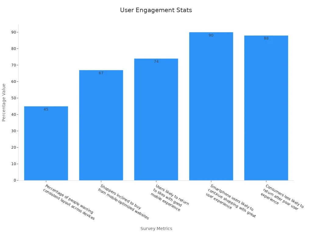
Responsive design makes apps look good on all devices. Users like apps that stay consistent, with 45% preferring uniform layouts. Mobile-friendly apps also make shoppers happy, with 67% buying more from them.
A great experience matters. Surveys show 74% of users return to apps with good mobile designs. But 88% avoid apps after bad experiences. Responsive design builds trust and keeps users coming back.
Preparing Apps for Future Devices
Technology changes fast, and apps need to keep up. Responsive design helps apps adjust to new devices, making them ready for the future.
Here are some reasons why responsive design matters:
Tools for building apps on all devices are growing. Apps must work well on desktops, tablets, and phones.
Progressive Web Apps (PWAs) are becoming popular. These apps need to work smoothly on any device.
People use their thumbs more on phones. Responsive design makes apps easier to use on small screens.
Using responsive design gets your app ready for new devices. It also makes users happy with easy navigation and steady performance.
Responsive design isn’t just for today’s gadgets. It’s about planning for how people will use technology later. Apps that focus on this stay useful and ahead in the digital world.
Key Principles of Responsive Design
Using Fluid Layouts and Flexible Grids
Fluid layouts and grids help apps fit any screen size. These tools let designs adjust smoothly to different devices. Instead of fixed sizes, fluid layouts use percentages or relative units. This keeps everything balanced and easy to use.
Many popular platforms use flexible grids to improve user experience. For example:

By following these ideas, your app will look great and work well everywhere.
Adapting to Screen Sizes and Orientations
Apps should work with all screen sizes and directions. People often switch between portrait and landscape modes on their devices. To handle this, design your app to change as needed. Use formulas like Parent.Width and App.Width to adjust layouts based on space.
For instance, you can make images resize to match the screen width. This keeps your app looking good and working properly. Test your app in both orientations to ensure it works well no matter how users hold their device.
Ensuring Control Responsiveness
Responsive design also means making buttons and fields adjust. Controls should resize and move to fit different screens. A button that works on a desktop might need to be bigger on a phone for easy tapping.
Set control properties to change size and position automatically. Use relative alignment to keep everything in place. Test your app on different screen sizes to find and fix any problems with controls.
Tip: Always use the Preview feature in Power Apps to test your app. This helps you spot and fix responsiveness issues early.
Leveraging Relative Positioning and Alignment
Relative positioning and alignment help apps adjust to different devices. These methods keep your app’s layout neat and easy to use on any screen size.
When building your app, align elements to a grid system. This makes your app scalable and look good on all devices. Fixed positioning can cause problems on various screens. But relative positioning lets elements move and resize as needed. For example, a button using relative alignment will shift properly when the screen size changes, staying easy to use.
Focus on important screens where users interact the most. These include forms, dashboards, or menus. Keeping these areas clear and functional improves the user experience.
Here’s why relative positioning and alignment work well:

To use relative positioning in Power Apps, apply formulas like Parent.Width and Parent.Height. These formulas set element sizes and positions based on their container. For example, setting a label’s width to Parent.Width * 0.8 makes it take up 80% of the container’s width. This keeps your app responsive and visually balanced.
Tip: Test your app on different devices to check alignment. Use Power Apps’ Preview feature to find and fix issues early.
By using relative positioning and alignment, you can make apps that look good and work well on all devices. This is key to responsive design, ensuring your app stays useful and accessible in today’s multi-device world.
Step-by-Step Guide to Implementing Responsive Design
Setting Up Containers for Layout Management
Containers are key to making apps adjust to screens. They help organize layouts and make elements fit different sizes. Start by adding containers to your app. These are flexible boxes that hold items like buttons, text, and images.
To add containers:
Open Power Apps and go to the Insert tab.
Pick a container type, like vertical or horizontal.
Put controls inside the container.
Containers resize automatically based on their parent size. Use settings like Width and Height to make them flexible. For example, set a container’s width to Parent.Width * 0.9 so it takes up 90% of the screen width.
Tip: Group similar controls in one container. This keeps layouts neat and easy to manage on all devices.
Using Breakpoints for Adaptive Behavior
Breakpoints help apps change layouts for different screen sizes. These are specific widths where the app adjusts to fit the device. For example, you can design one layout for wide screens and another for smaller ones.
To use breakpoints:
Set width limits with formulas like
If(App.Width > 768, "Desktop", "Mobile").Change control settings based on the breakpoint. For example, hide a sidebar on small screens by setting its
Visibleproperty toApp.Width > 768.
Breakpoints make apps look good on all screen sizes. Test your app at different widths to ensure it switches layouts properly.
Note: Use Power Apps’ Preview tool to test breakpoints and check layout changes.
Applying Formulas for Dynamic Resizing
Formulas help controls adjust to screen sizes. They let you change sizes and positions based on the screen. Use formulas like Parent.Width and Parent.Height to make layouts flexible.
How to use formulas:
Pick a control, like a button or label.
In the settings, set
WidthorHeightwith a formula. For example,Parent.Width * 0.5makes the control half as wide as its container.Use formulas like
Parent.Width * 0.1to position controls inside the container.
Dynamic resizing keeps apps looking good and working well on all devices. Test resizing by previewing your app on different screens.
Tip: Combine formulas with breakpoints for better results. For example, use
If(App.Width > 768, Parent.Width * 0.5, Parent.Width * 0.8)to adjust sizes based on screen width.
Testing Responsiveness Across Devices
Testing makes sure your app works on all devices. It helps find and fix problems before users see them. A responsive app adjusts to different screen sizes and directions. This gives everyone a smooth and consistent experience.
Why Testing Matters
Devices come in many sizes, from small phones to big monitors. Without testing, your app might look good on one device but fail on another. Testing keeps your app easy to use and nice to look at everywhere.
Tip: Test your app in both portrait and landscape views. Many people switch between these modes.
Steps to Test Responsiveness
Follow these steps to check your Power Apps:
Use the Power Apps Preview Tool
The Preview tool shows how your app looks on various screens. Open your app in Power Apps Studio and click Preview. Resize the window to mimic different devices.Test on Real Devices
Emulators help, but real devices give better results. Try your app on a phone, tablet, and computer. Check if buttons, images, and text adjust properly.Check Touch and Click Features
Mobile users tap, while desktop users click. Make sure buttons are big enough to tap easily. Also, check if mouse clicks work well.Simulate Slow Networks
Some users have slow internet. Test how your app works with slower speeds. Use tools like Chrome DevTools to try this.Validate Breakpoints
If you used breakpoints, make sure they work. Resize your browser to see if layouts change correctly at each breakpoint.
Tools to Simplify Testing
Here are tools to help test your app:
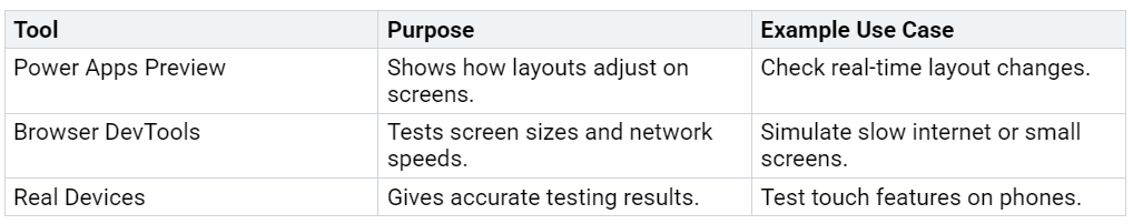
Note: Testing on different devices ensures your app works for everyone.
Final Checks
After testing, review your app for any issues. Focus on important screens like forms and dashboards. Fix any problems with alignment, size, or features. Once everything works perfectly, your app is ready to go.
Testing your app’s responsiveness ensures it works well everywhere. This step is key to keeping users happy and building trust.
Common Challenges and Solutions in Responsive Design
Balancing Performance with Responsiveness
Making an app responsive can slow it down sometimes. Adjusting to different screen sizes may use more resources. To fix this, shrink images before uploading them. This keeps loading fast without losing quality.
You can also use conditional formulas to help. These let the app load only what’s needed for the screen size. This makes the app faster and less heavy. Always test your app on slow and fast devices. This ensures it works well for everyone.
Managing Complex Layouts and Nested Controls
Complicated layouts with many controls can slow apps down. To fix this, group similar controls into containers. Containers keep things neat and easy to adjust for all screens.
Tools like Amazon Textract can also help. This tool finds parts like headers and sections in your layout. It keeps your app organized, even with many elements. Using such tools makes your design clean and simple.
Ensuring Consistency Across Screen Sizes
Apps should look and work the same on all devices. To do this, use relative positioning and alignment. For example, set a button’s width to half the screen size. This way, it adjusts to fit any screen.
Testing is very important for consistency. Check your app on different devices and directions. Fix any problems to make sure it works smoothly. A consistent app keeps users happy and coming back.
Debugging and Testing for Edge Cases
Debugging and testing edge cases help Power Apps work well. Edge cases are rare problems that might break your app. Fixing these issues makes your app reliable and keeps users happy.
Why Test for Edge Cases
Edge cases often show hidden problems. For example, a user might type a very long name or use an old device. Without testing, these situations could cause errors or crashes. Solving edge cases makes your app stronger and easier to use.
Steps to Debug and Test Edge Cases
Follow these steps to find and fix edge case problems:
Try Unusual Inputs
Test your app with extreme values. Type very big numbers, special symbols, or leave fields blank. Check if your app handles these inputs correctly.Use Different Devices
Test your app on various devices, including older ones. Look at screen sizes, operating systems, and browsers.Check Performance with Many Users
Pretend many people are using your app at once. This helps you find slowdowns or other issues.Use Debugging Tools
Power Apps has tools like App Checker and Monitor. These tools find mistakes and show how your app runs.
Examples of Edge Cases to Test
Here are some edge cases to check:
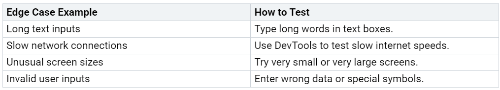
Tip: Test your app in both portrait and landscape views. This keeps the app working well in all directions.
By testing and fixing edge cases, your app will work smoothly for everyone, even in tricky situations.
Best Practices for Responsive Design in Power Apps
Starting with a Mobile-First Approach
Designing for mobile screens first makes apps work better. This method focuses on small screens before larger ones. It highlights key features and keeps layouts simple. Mobile-first design can increase conversions by 15% to 30%. With mobile shopping expected to hit $4.01 trillion USD by 2025, focusing on mobile users is crucial.
Begin by designing for smartphones. Use grids that adjust and add touch-friendly buttons. After finishing the mobile version, expand it for tablets and desktops. This ensures your app looks good and works well on all devices.
Tip: Test your app on different phones to check its performance.
Using Standard Templates and Guidelines
Templates and guidelines make designing easier and more consistent. Power Apps provides ready-made templates that follow good design rules. These templates save time and help avoid mistakes, especially for beginners.
When using templates, change them to fit your app’s needs. Adjust colors, fonts, and buttons to match your brand. Follow rules like keeping layouts clear and using readable fonts. This makes your app easy to use and meet user expectations.
Note: Templates are helpful, but always test your app to ensure it fits your goals.
Designing for Scalability and Future Updates
Scalable designs let your app grow with your needs. Build layouts that adjust for more users, features, or devices. Use containers and flexible positioning to make updates simple. These tools help layouts adapt automatically.
Plan for updates by keeping your design organized. Group similar controls together and name them clearly. This makes changes faster and easier. A scalable app stays useful as technology changes, keeping users interested.
Tip: Check your app often and update it to meet new needs.
Iterating Based on User Feedback
Listening to users helps make Power Apps better. It shows what needs fixing and improves the app’s design. This makes the app easier to use and builds trust with users.
Feedback tells you how the app works in real life. Numbers like task success rates show how users complete tasks. If users struggle, it might mean the layout needs changes. Opinions about satisfaction and usability give more details about user feelings. These ideas help you update the app to match what users want.
Tip: Ask users questions with surveys or feedback forms. Simple questions like “What do you like most?” can give helpful answers.
Using feedback improves apps in big ways. Apps that listen to users make people 17% happier. Loyalty scores, like NPS, go up by 13% when feedback is used. These numbers prove that listening to users makes apps better.
Follow these steps to improve your app:
Gather feedback using surveys, tests, or app data.
Study numbers like task success and opinions about usability.
Make changes based on what you learn.
Test the new version to see if users like it.
By updating your app based on feedback, it stays useful and meets user needs. This keeps users happy and makes the app work well for a long time.
Responsive design helps Power Apps work well on all devices. It makes apps easy to use, more accessible, and ready for future changes. This design not only improves usability but also keeps users interested and satisfied.
Follow the steps and tips in this guide to get started. Test your app carefully and improve it using feedback. With responsive design, you can create apps that stand out in today’s multi-device world.
FAQ
What is responsive design in Power Apps?
Responsive design helps apps fit different screen sizes and directions. It uses flexible layouts, grids, and formulas to adjust automatically. This makes apps work well on desktops, tablets, and phones. It also improves how easy and accessible they are for everyone.
How do you test responsiveness in Power Apps?
Use the Power Apps Preview tool to see how layouts adjust. Try your app on real devices like phones, tablets, and computers. Test with slow internet and check breakpoints to ensure it works smoothly everywhere.
What are breakpoints, and why are they important?
Breakpoints are screen widths where the app changes its layout. They help apps look good and work well on all devices. For example, you can hide menus on small screens using breakpoints.
How can you make controls responsive?
Set control sizes like Width and Height with formulas such as Parent.Width * 0.5. This makes controls resize to match the screen size. Test them on different devices to make sure they stay easy to use.
Why should you use a mobile-first approach?
A mobile-first approach starts with designing for small screens. It keeps layouts simple and focuses on key features. Once the mobile version works, you can adjust it for bigger screens. This ensures your app works well on all devices.


