


Confession time: the first time I opened a model-driven form in Power Apps, I had no idea what I was looking at. It felt like peeking under the hood of a spaceship—exciting, but intimidating. What began as a practical experiment soon spiraled into a deep, surprisingly personal quest for order (and maybe a little bit of software zen). Ever felt a tool teach you something about your own need for structure? That was me, fumbling my way from chaos into clarity.
The Unexpected Backbone: Why Model-Driven Forms Hooked Me
When Efficiency Sneaks Up on You
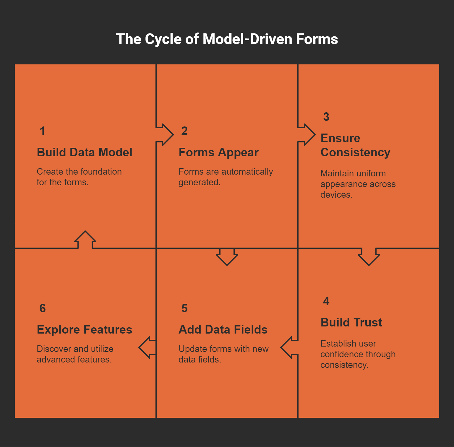
I’ll confess: the first time I tried model-driven forms, I almost didn’t trust it. I was so used to dragging fields, fussing over layouts, and sweating the tiniest device quirks. Model-driven? It felt like cheating.
But then something wild happened. As I built my data model, the forms just appeared—structured, functional, and ready to use. No endless tweaking. No patchwork fixes for mobile. The app felt like it was building itself while I sipped my coffee. Is this what efficiency feels like?
The Comfort of Predictability in a Wild World
Let’s be honest: low-code app design is often the wild west. Buttons float. Fields vanish. What looks perfect on your laptop turns into a pixelated mess on your phone.
Model-driven forms brought something rare: predictability.
I knew my users would see the same interface on desktop, tablet, or mobile.
For once, I didn’t feel like I was wrestling an octopus just to keep things aligned.
"Consistency is the key to adoption in any business app." – A Power Platform enthusiast I met at a user group
That quote stuck with me. I saw how consistency builds trust. And trust is what gets people to actually use the thing you built.
The Backbone I Didn’t Know I Needed
Some days, my app ideas come out half-baked and all over the place. But model-driven forms? They felt like a backbone—keeping everything upright while I ran wild with features.
Want to add a new data field? The form updates, no sweat.
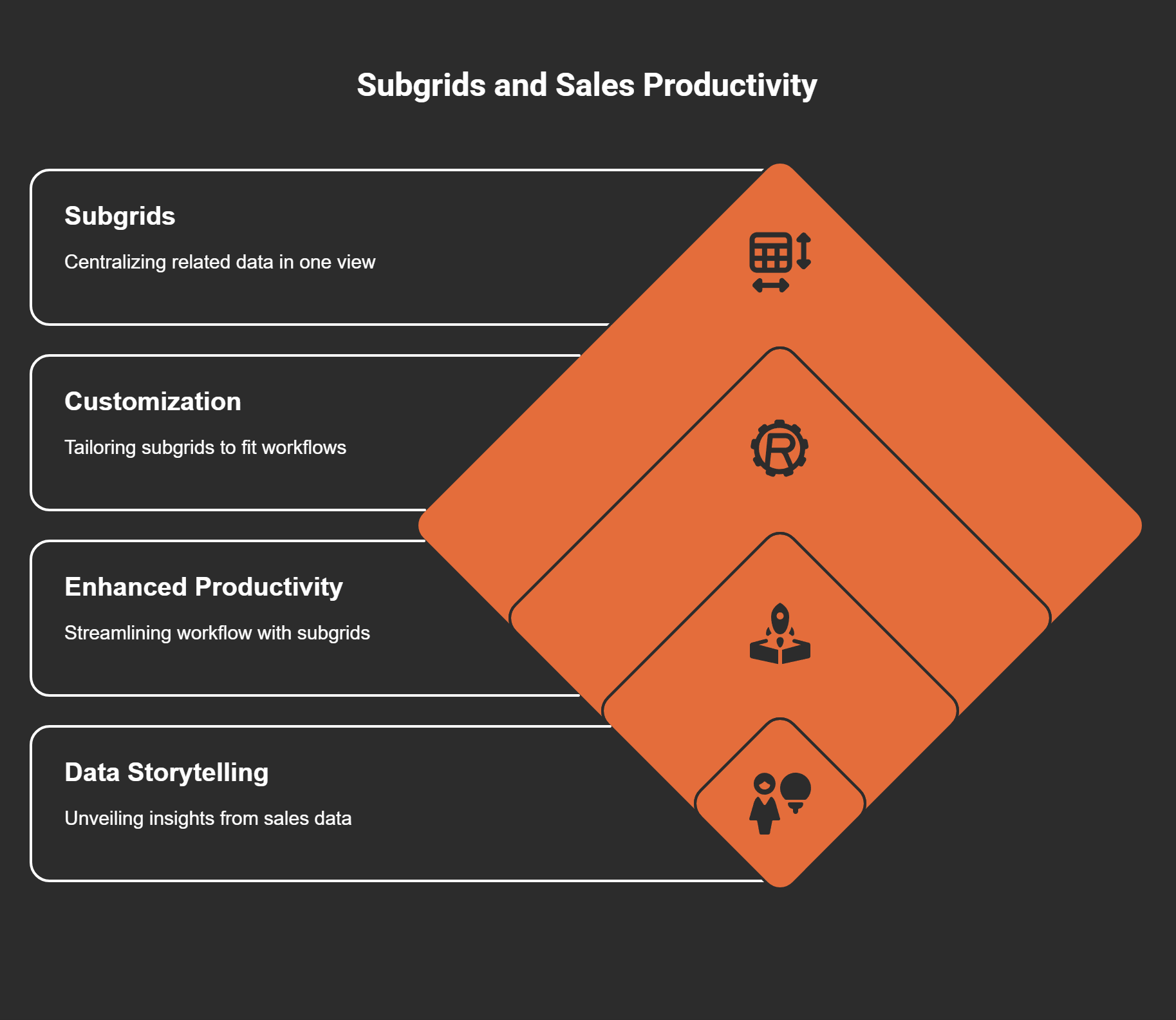
Need to show related info? Advanced features like subgrids are just waiting for me to notice them.
Before this, balancing flexibility and consistency across devices was a never-ending struggle. Now, it almost feels... unfairly easy? Maybe a little. But I’ll take it.
Hidden Power Under the Hood
Advanced capabilities—like subgrids for deeper data relationships—keep teasing me with new possibilities. The best part? I’m not stuck redoing everything when things change. The form grows as my app grows. That’s a rare gift in this business.
Unpacking the Moving Parts: Headers, Tabs, and Sections (A Love–Hate Relationship)
The Heart of Model-Driven Forms
I remember the first time I cracked open a model-driven form in Power Apps. My brain was like, Where do I even start?
Turns out, it’s all about wrestling with three main components—headers, tabs, and sections. These bits do the heavy lifting, bringing order to the chaos just waiting to happen in any app. Each piece, as I soon found out, has its own quirks and charms.

1. Headers: My Planner Addiction, Reincarnated
Headers always take me back to my old-school paper planners. You know, the kind where you scribble the day's top priorities at the very top so you don’t forget. In model-driven forms, the header works the same way—it floats up there, holding crucial details you want front and center. Things like account names or statuses live here. No need to dig around. It’s like your brain’s sticky note—if only life were always this organized.
2. Tabs: Scrolling Is Overrated
Remember scrolling endlessly through a giant form on your phone? I used to, and wow, my thumbs hated it. Tabs changed everything. Now, instead of one gigantic scroll-fest, I just click a tab and land exactly where I need. It’s the difference between rifling through a messy drawer and neatly labeled folders. (Except, let’s be honest—I still have a messy drawer somewhere.)
3. Sections: My Dream Fridge (But for Data)
Sections are a godsend for folks like me who—despite best intentions—can’t keep the fridge organized. Sections group related info, letting me corral fields together much like I’d love to corral veggies, condiments, and last week’s leftovers (if only). In forms, sections keep related data fields together, so everything makes sense at a glance.
Picking the Perfect Layout (and a Little Indecision)
Customizing each piece? It’s a bit like furnishing a tiny apartment. Space is limited, every choice matters, and sometimes you have to live with a weird chair (or section) until you get it right. But once you get the hang of headers, tabs, and sections, suddenly your forms start making sense—to you, and everyone who uses them.
"The best UI is the one you don’t notice—it just works." – Jane Lee, UX Lead at Digital Dynamics
Headers, tabs, and sections—they’re the foundation. Master these, and everything else just clicks, almost like magic. (Almost.)
Wild Card: Subgrids & the Story of My Sales Pipeline Epiphany
The Day Subgrids Changed Everything
Ever have one of those days where a tool just clicks, and suddenly the way you work makes sense? That’s what happened to me with subgrids in model-driven forms. I remember staring at my sales pipeline, jumping between different screens—contacts here, deals over there, follow-ups lost somewhere else. My tabs were a mess. My brain was frazzled. I thought, is there not a better way?
The Magic of Seeing It All in One Place
Enter subgrids. Imagine opening a customer record and, instead of clicking away to find the latest deal or chasing down who last followed up, everything you need is right there, neatly displayed below the main form. Contacts? Check. Deals? Check. Follow-ups? Right there.
Subgrids let me see contacts, deals, and follow-ups without ever leaving my current form.
Reducing back-and-forth ‘screen hopping’ felt like magic for productivity.
It’s not just convenient. It’s transformative. There’s no more context switching, no more losing your train of thought halfway through a sales call because you had to dig through endless menus. Suddenly, my sales data wasn’t a confusing puzzle. It started telling a story, right there in the form, front and center.
Customizing for My Workflow
The real kicker? I could tweak the subgrids themselves. Filters, sorts, column choices—you name it. I started setting up views that matched the way I actually worked. Focused. Tailored. No wasted information.
Customizing subgrids (filters, sorts) allowed the form to fit sales workflows perfectly.
Realization: my sales data finally told a story, right there in the form.
It felt… almost too easy. Like someone handed me a cheat code for my own job. I could spot lulls in my pipeline just by scrolling. Missed follow-ups? They stared me in the face until I acted. I wasn’t lost in the weeds anymore.
"Seeing all your related data in one place is game-changing for decision making." – Priya Sharma, Sales Analyst
Why Subgrids Matter
If you ask me, subgrids are the unsung heroes of the model-driven form world. They surface the stuff that matters, cut out the noise, and, honestly, let us focus on what we actually care about: the story our data is trying to tell. And even if it’s not perfect every day, at least I’m not chasing my tail through a dozen different screens anymore. That’s progress.
Snapshots in a Click: Quick View Forms and the Art of (Not) Switching Windows
The Cheat Sheet You Never Knew You Needed
Ever feel like you’re juggling too many browser tabs just to find a single detail? That was me, bouncing back and forth, losing my place more times than I want to admit. Then—almost by accident—I stumbled on quick view forms in Power Apps. It hit me like finding the answer key before a big test.
Imagine opening a contact record and, bam, the parent account’s basic information is right there. No extra clicks. No new windows. Just a neat, read-only block embedded where you need it. A digital cheat sheet for every record. Who knew business software could actually save your sanity?
Why Context Matters More Than Ever
Quick view forms display parent record fields directly inside a child’s form.
Perfect for context: Key details like account owner, address, or status show up—zero disruption.
No more workflow chaos. Just a seamless glance at exactly what you need.
One day, I noticed something odd. I was breezing through tasks that used to take five, sometimes ten, clicks—my brain felt lighter. Tasks that once seemed clunky suddenly flowed: open a record, glance at the parent data, move on. It’s a little thing, sure, but honestly, it changes everything.

Subgrids vs. Quick View Forms—A Tiny Tug-of-War
Now, I’ll admit. Not all relationships are built the same. Sometimes, you need to see a list of related items—a bunch of contacts tied to an account, for example. That’s where subgrids shine.
For simple, one-to-one or parent-child data, quick view forms are unbeatable.
Subgrids? Better for lists and many-to-one or many-to-many relationships.
It took me a while to figure out when to use which. There’s no shame in learning the hard way, right?
A Little Wisdom from the Experts
"Efficiency is all about keeping your eyes on the task—not the navigation bar." – Ravi Patel, Power Apps Trainer
That line stuck with me. Because, honestly, the less I have to hunt for information, the more I actually get done.
So, quick view forms? They’re not just convenient—they’re a lifeline for clarity amid the daily whirlwind.
Where Magic Meets Logic: Responsive Layouts & Custom Canvas Pages
Phones, Tablets, and a Designer’s Dilemma
It started with a simple problem—my forms looked fine on my laptop, but the moment I opened them on my phone, things… broke. My old tablet (the one with the cracked screen and eternal battery warning) was even worse. Fields jumbled, buttons half-hidden, and don’t get me started on scrolling. It was chaos.
Ever tried fixing a layout while your cat walks across the keyboard? That’s how my week went.
The Magic of WYSIWYG: My New Sidekick
I found salvation in the WYSIWYG designer (What You See Is What You Get). Suddenly, I was dragging tabs, shrinking sections, previewing for every screen. Tweak. Preview. Curse. Repeat.
Responsive options in the form designer let me make every field behave—even the stubborn lookup ones.
Previewing for different resolutions? Non-negotiable. I learned that after a user called to say a submit button was "hiding for the winter."
"The line between function and art is blurred when you design a truly responsive app." – Maya Tran, App Designer
Canvas Pages: App Superpowers Unlocked
But then, something shifted. I stumbled upon custom canvas pages. Suddenly, it was more than just responsive layouts. It was dashboards that reacted to clicks, wild color schemes, and buttons that did clever things. Embedding these pages into model-driven apps felt a bit like getting superpowers.
Interactive dashboards—pie charts spinning, data bursting to life.
Unique layouts, not just grids and fields. I could draw the page, not just arrange it.
Custom logic—automations and clever visual tricks baked right in.
Mixing structured data with creative interfaces? That’s where doors opened I hadn’t even considered. I realized, for the first time, that responsive layouts and canvas pages weren’t just for show. They were for everyone—users on phones, tablets, or desktops (or that one guy on an ancient browser).
Quick Takeaways
Don’t skip the preview. Always check every device.
Canvas pages = creative freedom inside structure.
The balance between usability and design? It’s real—and sometimes messy.
I’ll be honest, sometimes things still break. But the journey from chaos to clarity? Feels like magic and logic in perfect, imperfect harmony.
Wild Card: When Less Is More—And How Too Much Broke My App
Let me tell you, I learned the hard way that more is not always better—especially with model-driven forms. Picture this: I started out building this slick Power Apps form for my team. I was on fire, adding subgrids here, quick view forms there. At first, it felt like I was driving a Ferrari. Flashy, powerful, smooth.
But then—bam. Next thing I know, my app felt like it had been swapped for a freight train. Heavy. Slow to start. A single click lagged. The form took its sweet time loading. I’d wait, sometimes holding my breath, hoping it would snap out of its trance. Spoiler: It rarely did.

When Too Much Breaks the Magic
What happened? I’d overloaded my forms with too many complex features. Each subgrid meant more data loading. Every quick view form called extra info from the server. It was like throwing marbles in my Ferrari’s engine—sure, they fit, but they wrecked the ride.
So I panicked for a bit. Then I rolled up my sleeves and started searching for ways to lighten the load. That’s when I discovered performance tuning:
Limit records in subgrids. Don’t show hundreds if you just need the latest five.
Use caching when possible. Every repeated data call slows things down.
Honestly, it felt like magic. Things sped up. My team stopped groaning every time they opened a form.
Testing Like a Treasure Hunt
Now, I don’t publish anything without testing form speed. I poke around every tab, click every button—like I’m hunting for Easter eggs. Is it fast? Does it freeze? Any hint of lag and I go back to the drawing board. Responsiveness is the prize I’m after now, every single time.
"Speed is its own feature—never trade it away lightly." – Samira Johnson, Power Platform Consultant
I get it—advanced features are tempting. But the real art is in balance. You want your app to impress, but it has to perform. There’s no point having all the bells and whistles if users are stuck waiting. I learned (sometimes painfully) that every extra feature comes with a price.
In the end? Keep things simple, optimize wherever you can, and test like your users’ time depends on it. Because honestly—it does.


