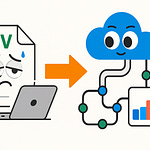
Ever noticed how your company logo looks perfect in Teams, but disappears when users hit the login screen or open SharePoint? We’re about to reveal why those tiny branding gaps can hurt trust and user confidence—and exactly where most businesses go wrong inside M365.
Most admins fix the obvious settings and miss the hidden ones. Stick around and we’ll map out the real trouble spots you can’t afford to overlook if you want true, end-to-end consistency.
The Hidden Cost of Forgetting Your Brand
If you’ve ever watched employees bounce from Teams to SharePoint to the login screen, eyebrows furrowed, you already know the feeling. Teams is smooth, the logo’s right, colors dialed in. But SharePoint? Suddenly, it’s a mess of blues and whites. Out comes the default Microsoft logo. Open the login screen and now it’s Office 365 orange with no sign of your company’s colors anywhere. Most users won’t say a word, but you’ll see that look—“Am I even in the right place?” That creeping sense of, “Did I just get phished?” Even when they’re staring at perfectly legitimate company resources, a little doubt sets in.
Let’s pin down exactly how this plays out. Picture an employee starting their morning. They open Teams, see your company’s blue and gold banner, maybe even a custom icon. It almost feels like home. Five minutes later, they need a client file so they jump to SharePoint. Suddenly, everything’s boxy, brand colors are gone, and there's a default SharePoint logo up top. Navigation feels different—like wandering into somebody else’s office by accident. Then, when they hit the Office 365 login screen later, they see Microsoft’s branding, no trace of the company’s look, and maybe even a generic background image. These micro-contrasts seem harmless, but for users, they signal disconnection. No matter how many posters you hang about cyber security or digital trust, that instant hesitation pops up. Nothing tanks confidence faster.
Now, let’s ground this in the real world. I worked with a manufacturing firm that invested a chunk of budget rolling out Teams globally. They set up custom logos, configured the perfect accent color, and even tuned notifications. But SharePoint was still running the vanilla Microsoft theme. Login screens? Still orange and white. No custom banners. After launch, tickets rolled in: users thought they’d landed on untrusted sites. One group reported they’d accidentally sent sensitive files through personal email, just because they couldn’t recognize “their” SharePoint. Adoption lagged. Three months later, execs asked if the Teams push was broken. It wasn’t the tools—it was that whiplash from branded to default, over and over.
The more you look into it, the less surprising it gets. Dr. Susan Weinschenk, a behavioral psychologist, points out that “users make decisions about trust in under a second, based on visual cues.” Companies pour resources into securing their environments, but inconsistent branding leaves visual trails that whisper, “you’re not home.” In fact, studies from the Nielsen Norman Group show that interface inconsistency increases cognitive load—meaning people have to think harder to confirm they’re safe, or even that they’re working in the right place. The more steps it takes for an employee to orient themselves, the slower things get. And when that trust erodes, adoption takes a hit.
Let’s talk about where Microsoft itself gets in the way. Even if you customize every possible surface today, a default theme is always lurking. Microsoft’s design updates happen behind the scenes—sometimes without warning. Suddenly, a button or banner quietly reverts to the standard blue, and users notice before admins do. It’s like tidying up three rooms of your house, then having a contractor repaint the hallway without asking. HR announces “we’re one team” but login pages still push Microsoft’s brand front and center. That disconnect seeps into company culture, eroding the sense of unity you’re trying to build.
It might sound like nitpicking, but there’s data behind the pain. According to research by IDC, companies lose up to 20% in productivity from users feeling disconnected from their digital workspace. Visual inconsistency is a major culprit—little moments of second-guessing, seconds wasted hunting for confirmation, and time lost switching between mindsets. There’s no line item on the budget for confusion, but it all adds up. Every time an employee second-guesses their workspace, process flow gets interrupted.
Now, imagine if you could close these tiny branding gaps for good. No more awkward login screens or default logos peeking through. Users sit down, open any M365 app, and immediately know they’re in company territory. That sense of familiarity builds trust—not just in your tools, but in the bigger picture decisions IT makes.
Consistent branding goes far beyond just planting a logo everywhere. It’s about smooth handoffs between apps and reinforcing that “this is us” feeling every time someone logs in, collaborates, or shares data. When things feel unified, people work faster and hesitate less. They know a link or notification is “real,” and new tools land with less friction. It’s a win nobody celebrates—until you see how much smoother everything runs.
Most admins only tweak what’s obvious—the Teams icon, SharePoint’s main color. The real branding problems hide deeper, in corners most people never visit until it’s too late. Those overlooked settings are where consistency dies. So let’s dig into what you can—and can’t—actually brand, and why it matters.
What You Can—and Can’t—Actually Customize
Most admins could probably name the big three when it comes to M365 branding: slap a logo on Teams, pick a SharePoint site accent color, and maybe swap out the background image on the login page. That’s where most branding projects begin—and unfortunately, where a lot of them end. You get a fancy new logo on Teams meetings, SharePoint has a blue or green splash, and the login screen isn’t as cold. It feels like the work is done, but if you ask actual end users, cracks show up almost instantly.
Let’s run through what people normally remember to touch. The Teams admin center gives you a spot for a custom organization logo and, if you go digging, brand color settings. Within SharePoint Online, you can push a custom theme: company palette, navigation font, even a default SharePoint logo. Most folks also remember to head to the Azure portal, maybe upload a logo for the sign-in page so it doesn’t scream “Microsoft” quite as loudly. If you’ve done these three, you might feel covered. At this point, it all looks solid at a glance.
Now here’s where the fun starts. All it takes is a password reset, a login from a phone, or a user landing on an error page. Suddenly, your visuals drop away and Microsoft’s defaults jump right back in. Those secondary spots? Most admins don’t even know they exist, until a user forwards a screenshot that ruins your morning. The password reset screen uses whatever branding lives in Azure AD—even if you’ve refreshed everywhere else. Forgot to check the mobile Teams app splash screen? Microsoft’s purple flag waves in front of your company every time someone opens the app. There are subtle backgrounds—like generic gray swaths behind login modals, or the SharePoint “loading” animation—that can’t be touched. Go to a page not found or hit an error, and it’s a full Microsoft design. Try sending a document link to external guests; they often see the out-of-the-box Microsoft invitation, not your logo or brand at all.
So, what exactly can you—and can’t you—actually control in M365? Let’s break it down, starting with Teams. In the Teams admin center, you get access to “Organization branding,” which covers the app logo, some basic color choices, and the ability to upload a custom banner that shows up on the web. Ribbon color and accent shades are fair game, and you can set a company-specific icon that appears pretty consistently. But Teams on mobile ignores some admin branding entirely—users get Microsoft purple, no matter what you’ve set up. Meeting invitations still show the default Teams icon unless you push a custom mail template. And app tiles inside Teams (like Planner or Yammer) display Microsoft defaults, not your chosen color scheme.
SharePoint Online gives you far more to play with: custom themes, header images, navigation styling, and advanced SharePoint “site designs” using scripting. The SharePoint admin center lets you apply your brand as the default across all new sites. But some borders, system-level banners, and automated error messages can’t be touched. List views, system-generated emails, and workflow notifications usually revert right back to Microsoft blue and gray. If you send a site invite, guests are met with the standard “You’ve been invited to SharePoint Online” template—no logo, no custom language, just Microsoft.
Then you hit Azure Active Directory (or Entra ID), which might be the most frustrating of all. The login pages—the main one, plus password reset or “Terms of Use” consent prompts—allow a logo, background color, and a single custom illustration banner. But when a user tries to register a new device, review security info, or hits a permissions screen, all branding vanishes. Expired password? That reset flow is stuck on a bland default style unless you deploy branding in all the right corners. Look closely at admin portal screenshots and you’ll spot a pattern: branding sections are hidden under “Company branding,” and Microsoft’s own docs show long tables of which screen picks up which setting—sometimes with a note saying, “not supported in mobile.”
Seeing all this mapped out, it’s like painting three walls and leaving the fourth bare. Each missing spot is obvious—once you know where to look. The “before” version: home screens are branded, but password reset or mobile logins are all Microsoft. The “after” if you do everything right: smooth, continuous branding—up until you hit a boundary Microsoft still owns. Each little gap feels jarring, like mixing two puzzle boxes together and hoping the picture still makes sense.
Microsoft spells out where you can and can’t add branding if you know where to look, but it takes patience. Their branding guides and admin portals tuck options under deep menus, and the help docs politely remind you what isn’t supported: “Custom branding is not available for error pages,” “SMS login flows use Microsoft branding by default.” It’s a scavenger hunt, and if you skip a clue, users will spot the missing piece before you do.
Bottom line—being clear on what you can actually customize is more than nice-to-have. It’s what lets you start plugging those embarrassing gaps that users notice every day. And now that you know where the traps are, the next hurdle is making sure your changes stick everywhere, for every user, every time they log in. Getting consistency at scale is its own challenge, and most admins find this out the hard way the first time someone says, “Hey, why is Teams blue but SharePoint is gray on my phone?”
Mastering the ‘How’: Applying Consistent Branding Across M365
If you’ve ever changed a company logo in one admin center and waited, only to get a message the next day that another department still sees Microsoft’s icon on their sign-in page, you’re not alone. The reality is, unlike smaller apps with a single settings menu, Microsoft 365 spreads its branding controls across several admin centers, and they don’t always play nice together. You tweak something in Teams, but SharePoint still wears the old color scheme; adjust Azure AD branding and mobile users just carry on with Microsoft’s out-of-the-box look. It’s confusing even for seasoned admins, and downright frustrating for employees trying to get work done across devices or in hybrid setups.
Let’s map out why this happens. M365 splits branding between the Teams admin center, SharePoint admin center, and Azure Active Directory (or Entra ID). Each has its own branding options, quirks, and—sometimes—delays in actually showing your changes to end users. These admin centers don’t sync settings automatically. If you update your logo in Teams, that does nothing for SharePoint or Azure. Even within SharePoint, updates on the main portal might not push to subsites or legacy pages. This means branding becomes a game of whack-a-mole, not a one-and-done job. And if you’ve got users on desktops, laptops, and mobile devices, expect more inconsistencies. Some devices cache old images; others simply don’t support every branding tweak you make.
Now, picture your IT team rolling out a branding update. They update logos in Teams and SharePoint from their desks in headquarters, but a remote worker logs in from the field and sees none of it, just the old Microsoft blue. Another user opens the login screen and gets your custom background, but when they hit password reset, it jumps right back to default. That’s where trust problems—and support tickets—start multiplying. For hybrid or remote teams, this mixed experience turns small branding gaps into daily annoyances. Each time someone has to pause and wonder, “Is this really my company’s site?”, confidence and speed take a hit.
To break this cycle, let’s talk practical steps. First up is Teams. Head into the Teams admin center and find ‘Org-wide settings,’ then ‘Organization profile.’ Here, you upload your company logo, set your color scheme, and—in some regions—add custom banners. Save changes and wait for them to propagate across clients. But keep in mind: Teams mobile apps may ignore certain admin settings, so check those separately.
Switch over to SharePoint Online. The SharePoint admin center offers a ‘Change the look’ menu where you can set your global theme—logo, primary and accent colors, and even some header images. Advanced admins will turn to SharePoint site designs, which let you script themes for consistent application across new or existing sites. Still, don’t expect error messages or automated emails to carry your colors; some system surfaces are Microsoft-only.
Now, Azure AD (or Entra ID), controls branding for login, password reset, Multi-Factor Auth prompts, and Terms of Use screens. Inside Azure, go to ‘Company branding’ under Azure Active Directory. You’ll get slots for sign-in page background, banner logo, and accent color. There are preview options here, which is helpful. Make sure to scroll down—there are settings for both default branding and customized versions for specific languages or user groups.
Want to take it a step further? PowerShell makes large-scale changes manageable. With scripts, you can update Teams and SharePoint branding in bulk, apply consistent settings for thousands of users, or target groups—like interns or subsidiaries—with custom looks. It’s possible to use SharePoint PnP PowerShell to enforce themes on every site collection or introduce versioning, so you can roll back a change without starting over. Versioning also becomes a lifesaver during mergers or rebrands, as you can test in separate tenants before rolling out to the company.
Here’s where things can fall apart. I’ve seen a marketing team get a shiny new Teams theme applied overnight, but the finance group kept plugging away with last year’s logo on SharePoint. Users noticed immediately. Support lines lit up: “Why do my screens look different from my coworker’s?” It turned into a week of back-and-forth, tracking down which settings missed which users, and patching things by hand—one admin even admitted to pushing changes at midnight, hoping to catch everyone offline. The point is, partial rollouts can sow confusion and lead to wasted hours cleaning up.
To keep confusion low, always preview your branding before pressing “apply” for everyone. Most admin centers offer a preview window, but don’t trust it blindly—spin up a test user or a pilot group. This lets you catch layout bugs, color clashes, or missing logos before 5,000 employees see a broken page. It also gives you a buffer if something doesn’t look right on a mobile device or in a specific browser.
When you streamline branding through the right admin centers, combine PowerShell automation, and stick to a disciplined preview-and-pilot approach, you can get as close to perfect consistency as the platform allows. Every surface you control will look and feel like your company, and user confusion drops off fast. It’s satisfying, but maintaining that edge means staying on your toes. Brands only stay consistent until the next Microsoft update lands—sometimes without warning, and always with a surprise or two waiting in the admin dashboard.
Troubleshooting, Gotchas, and Future-Proofing Your Brand
Okay, so you’ve spent hours tweaking every panel, uploaded the right logo in three different admin centers, and hit “apply” more times than you care to remember. Yet, you open the login screen and it still flashes that unmistakable 2016-era Microsoft orange, stubbornly ignoring your fresh branding. This is the part nobody warns you about. Updates don’t always show up for every user, and once Microsoft rolls out a backend update or UI refresh, your carefully laid plans can vanish, replaced by default themes that undo all your effort in a single click.
The honest truth? You’re not alone if you feel like you’re chasing your tail. I’ve seen admins wipe caches, check their settings for the tenth time, and even question if they made the change at all. Sometimes, you get lucky, and the fix is just waiting for the branding to propagate—Microsoft services aren’t exactly known for their blazing-fast updates. Other times, users across different departments or geographic regions see completely different experiences—not because you missed a setting, but because something got stuck, reverted, or didn’t apply universally. It doesn’t help that there’s almost always one person in finance who reports branding issues days after everyone else.
Let’s break down what actually goes wrong. Cached content is the repeat offender. Users’ browsers or mobile apps hold onto the old logos and color schemes, showing outdated branding until someone thinks to clear their cache or signs in on a new device. This can turn five minutes of troubleshooting into a full day of support tickets. Licensing is another tripwire—a feature might only apply if you’re using a certain Microsoft license tier, so a logo change works for E5 users but not E1 or Business Premium. Admin permission gaps cause headaches too. You might not have the right scope of access in Azure or SharePoint admin to push updates tenant-wide, leaving chunks of your workforce in the branding dark. And don’t forget, Microsoft isn’t shy about rolling out UI updates with little warning. New design refresh? There goes your color palette, rolled back to the default blue because the update only recognizes Microsoft’s branding as ‘safe’ until you reapply everything.
Here’s a story that hits close to home. Not long ago, a global non-profit finished their branding overhaul—company logos on Teams, SharePoint, all login experiences were dialed in. Then, with no warning, Microsoft pushed a UI update in Azure AD over a holiday weekend. By Monday, nobody recognized the sign-in page; support tickets spiked with users thinking it was a phishing attempt. The admin, fresh from vacation, logged in to find every change wiped and hours of painstaking customization trashed. They spent the next two days fixing logos, backgrounds, and retracing their steps through broken documentation, while calming confused staff and leadership. If you haven’t felt that pain yet, consider yourself lucky.
So, what can you actually do when things don’t look right? Start with the basics. Check that your changes have had time to propagate—some updates can take hours, or even a day, depending on the service and tenant size. Browers and devices could be holding stubborn copies of the old branding, so have users clear their caches or use private mode to test. Review your permissions in admin centers; make sure you’re not missing some global admin right needed to push branding out to every app. Don’t forget policy assignments, either: a custom theme tied to a security group won’t show up for everyone by default, so double-check group membership and policy scope.
If nothing else works, walk through a simple checklist: Are your branding changes correctly uploaded on each platform? Have you published updates for both default and device-specific experiences? Are you missing coverage for error pages, password resets, or mobile sign-in flows? Have you checked the Microsoft admin portal for recent UI updates or feature rollouts that might impact branding? These questions can save hours of trial and error, and prevent a flood of confused user emails.
Looking ahead, future-proofing your brand inside M365 means adopting a strategy, not just a set of steps. Schedule regular branding audits—at least once a quarter, or whenever Microsoft announces a major update on the roadmap. Stay tuned to the Microsoft 365 Message Center, where many branding-impacting updates are teased weeks (or sometimes days) in advance. Documentation is your friend: keep a reference log of every branding setting, including admin paths, backup image files, and a record of when changes were last made. This helps you recover faster when—inevitably—Microsoft changes something overnight.
Some Microsoft MVPs recommend building a “branding runbook,” listing out every possible branding touchpoint, so you don’t miss a setting during rollout or repair. Leverage PowerShell scripts to automate checks or deploy updates in bulk, rather than clicking through three admin portals each time. And always test branding in a separate pilot tenant if you can, especially before or after a major update, so you catch changes that won’t be obvious until they hit production.
Even if it feels like you’re running on a treadmill, a strong process means your company branding stays steady—no matter how often Microsoft likes to move the finish line. With persistence and a little admin know-how, users arrive at the right app, see the right logo, and know they’re exactly where they’re supposed to be. So what does it take to keep all of this working in the long run? Let’s talk about the bigger picture of getting branding right across your entire organization.
Conclusion
If you want users to actually trust the tools you roll out, half-finished branding won’t cut it. True Microsoft 365 branding isn’t a task to check off once—it’s a living piece of how people feel connected and confident in your organization day to day. If your login screen looks off or one app slips back to Microsoft defaults, people notice. Consistent branding makes your workplace feel like one team, not a folder of unrelated apps. Subscribe for more straightforward strategies on modern M365 management, and drop a comment if you’ve wrangled inconsistent themes—someone else is definitely facing the same pain.


