Ever wonder why HR reports never seem to match up, even when you’re drowning in Microsoft 365 data? Today, you’ll finally see how Microsoft Fabric can unify your Dynamics 365 HR data and bring outside sources into one reliable dashboard—without the spreadsheet stress. If you’ve ever spent hours reconciling onboarding stats, leave requests, or attrition numbers, this is the hands-on walkthrough you need. Curious how all those metrics actually come together? Watch as we transform tangled HR data into crystal-clear insights you’ll wish you had yesterday.
Why HR Data Unification Isn’t Optional Anymore
If you’ve ever tried to run a simple attrition report and ended up bouncing between five tabs, three different systems, and a spreadsheet that never quite matches up, you already know how frustrating disconnected HR data can be. It’s supposed to be easy—a headcount here, an onboarding timeline there—and yet, you’re piecing it together like you’re solving a jigsaw puzzle with half the pieces missing their edges. Every week, you need to reconcile headcount with Finance, see who started or left, confirm pending onboarding, validate leave balances, and answer that one inevitable question: “Are we at risk of losing people?” The reality is, HR teams spend more time tracking down numbers than making decisions with them.
This is the daily grind in most HR departments that haven’t unified their data. You’ve got your core system—maybe it’s Dynamics 365, SAP, or something older—holding the “official” record of employees. But payroll is sitting over in a cloud service, time tracking lives in yet another platform, and when someone wants a report on demographics or burnout risk, you’re left pulling CSV exports and hoping nothing changed overnight. The spreadsheets get longer, the data gets older, and the trust in those numbers gets shakier every month. Every time a department head wants a new metric—attrition trend, onboarding bottleneck, DEI stats—you’re flipping between systems, re-keying data, and resolving numbers that absolutely never match up with IT’s roster or the payroll report from last quarter.
This isn’t just annoying. It changes how HR decisions are made. When you can’t get trustworthy, up-to-date numbers on who’s leaving, why onboarding is stalling, or how leave balances are stacking up, you don’t make decisions—you make guesses. Workforce planning becomes a finger-in-the-air exercise. Roles get backfilled twice, or not at all, because no two sources agree on who’s eligible or who’s even on the team. Talent moves fast, especially in today’s hybrid world, but HR decision-making stays stuck in last week’s numbers. That’s how onboarding stalls get missed, budget forecasts go sideways, and people who are burning out go unnoticed until it’s too late.
Let’s talk about why this matters so much now. Hybrid work has changed the pace of talent movement. People join and leave faster, with less face-to-face checking in. If your data drags a week behind, by the time you identify a problem—say, a spike in leave requests or a pattern in voluntary exits—that trend has already cost you. The stakes used to be bad reporting and a few embarrassing moments in meetings. Now? Mistakes cost real money. Bad headcount planning leads to overhiring or layoffs. Delayed onboarding means teams sit without the skills they need, so projects slip. And because HR can’t prove their case with joined-up data, they get left out of the room where budget and strategy are set.
Here’s what this looks like in real life. At one global tech company, HR noticed voluntary turnover creeping up, but nobody could agree on how big the problem was. The numbers for terminations from the payroll system didn’t match what was marked in the HR core. Meanwhile, IT was offboarding accounts without double-checking with HR, so phantom users stuck around—a mess for both compliance and security. But the worst part? Because nobody had a clear line of sight over time off, overtime, and exit interviews, the trend of burnout didn’t get flagged. By the time anyone had pieced it all together using old-school exports, several top-performing engineers had already left for competitors, and the team’s projects were falling behind. All because HR was stuck reconciling last month’s data instead of acting now.
This isn’t a rare story. The numbers put it in black and white. According to recent studies, HR teams spend up to 40% of their time wrangling data from siloed sources, cleaning up duplicates, filling in gaps, or emailing people for corrections—time that could be spent actually supporting people or spotting issues early. Multiply that effort across onboarding, offboarding, compliance, payroll, and demographic reporting, and you start to see why HR feels buried and the business keeps running on assumptions.
Let’s get real about the risk: every lost hour shuffling data is an hour not spent understanding your people or pushing HR up the ladder of business strategy. When everything is in silos, crucial details slip through the cracks—missed attrition spikes, unaddressed onboarding bottlenecks, demographic trends that don’t get noticed until they hit Glassdoor. Slow response to change becomes the norm. HR misses out on influencing strategy, simply because the data isn’t there when it counts.
So here’s the thing—unifying HR data isn’t just about making easier dashboards. It changes where HR sits at the table. When you bring all those scattered data streams together and they finally agree, HR can actually prove trends as they happen, back up workforce planning with reliable numbers, and anticipate problems before they cascade. Suddenly, HR isn’t just reporting what went wrong, but can forecast, advocate for resources, and shift plans to match the business.
Of course, knowing the payoff is only half the battle. The real question—that one everyone asks after a failed integration project—is: what tools actually pull this off, without turning the data mess into an even bigger headache?
What Actually Powers HR Analytics in Microsoft Fabric?
If you’re used to thinking that a slick Power BI dashboard is all you need to fix HR’s data headaches, you’re about to hit a wall. Power BI has its place, but the magic really happens with Microsoft Fabric’s lakehouse model. This is what actually changes the game for HR analytics—not another reporting tool, but a built-for-purpose data foundation. Here’s what that hype is about, and why it’s not just another fancy layer on top of what you’re already running.
Let’s get this out of the way: most HR teams start the same way. The business wants numbers, so you bring in Power BI, point it at your Dynamics 365 HR system, maybe connect Excel if you’re brave, and then build visualizations. At first, it’s better than nothing. But if you’ve done this for more than a month, you’ve seen what happens. Fresh dashboard, same old data mess. Each report reflects just one source at a time—onboarding from Dynamics, demographics from your payroll export, leave balances from yet another spreadsheet. The pretty graphs just give you a faster way to spot what’s missing. And when someone asks for a metric that bridges more than one of those systems—good luck getting everything to line up without days of clean-up.
This is the trap a lot of teams fall into: thinking a shiny visualization layer solves fragmentation underneath. You end up building workaround on top of workaround. That’s how dashboards drift apart, numbers don’t reconcile, and the cycle of manual exports and late-night spreadsheet edits continues. The problems aren’t just about what’s on the screen—it goes all the way down to where and how your data is stored and prepped.
So what does Fabric bring? The real power in Microsoft Fabric isn’t about visualization at all. It’s the combination of three pieces: the lakehouse, Dataflows Gen2, and Power BI. If you want analytics that don’t break when the business changes, you need them working together. Here’s how they actually fit.
First, the lakehouse is the new home base for HR data. If you haven’t worked with lakehouses, think of them as the “one version of the truth” for your organization’s information. Instead of locking data in separate silos—one table for Dynamics, another for payroll, scattered files from external partners—the lakehouse collects everything into a single, scalable, cloud-based location. Fabric’s lakehouse can store structured and semi-structured HR data, so you capture everything from core employee records to external survey results, onboarding checklists, and even Excel-based time tracking. It’s not just about having all the files in one folder; it’s about being able to query, join, and cross-reference any piece of HR data you have, whenever you need it.
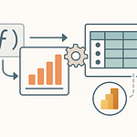
That’s where Dataflows Gen2 comes in. Think of Dataflows as your digital assembly line. They grab incoming data from Dynamics 365 HR and external sources, clean it up, shape it, and land it in the Fabric lakehouse in a ready-to-use format. Instead of dozens of manual steps—export here, import there, rewrite the same data transformation every month—Dataflows Gen2 lets you automate the boring parts. You define the source and the rules for prepping (things like mapping fields, standardizing job titles, normalizing department codes), and the process runs on a schedule. Now you have all your HR data—up to date, formatted correctly, and with the mess cleaned out—without a single CSV shuffle.
Then there’s Power BI, but not as the main event. With the Fabric architecture, Power BI switches from being just a reporting surface into a true front end for your lakehouse data model. It’s analyzing real HR data that’s already been unified and validated in the lakehouse—not making guesses from half-synced sources. Any dashboard you build is showing metrics from the actual source of truth, with the benefit of refresh cycles and the consistency that comes with automation. That means your onboarding durations, leave balances, workforce demographics, and even more complex cross-system trends are all using the same, agreed-upon numbers.
One huge misconception here is that Power BI by itself can do it all. It can’t—and it’s not designed to fix broken data silos. Fabric’s bigger ecosystem is what’s built specifically for this kind of unification and scale. It’s designed so you don’t need to cobble together the full Azure stack or pay for a data warehouse you never fully configure. If your HR analytics setup is leaving you with more questions than answers, it’s probably not about your reporting skills—it’s about where your data actually lives and how it gets there.
Take something as simple as onboarding timelines. Instead of reconciling start and end dates between HR and IT, the Fabric model lets you pull them both into the lakehouse, map employee IDs, and spot gaps right as they happen. Leave balances are always tricky when external payroll or benefit systems are involved—when the information lands in the lakehouse with standardized mapping, you catch discrepancies immediately. Demographic reporting is finally possible at scale, without spending hours reformatting every data dump.
This is the mini-payoff HR teams are always chasing—seeing dashboards that actually match what’s happening, not just what’s in a single data silo. It means decisions based on timely, verified numbers across your workforce. But no matter how perfect the architecture sounds, none of it matters if you can’t get the right data in, on time, and keep your connections working. So how do you actually bridge between Dynamics 365 HR, your various external sources, and the Fabric lakehouse without everything breaking?
Connecting Dynamics 365 HR and External Systems—Without the Headaches
Let’s talk about what happens when “seamless integration” actually means late-night calls and half-working flows. If you’ve ever tried wiring up Dynamics 365 HR to anything outside the Microsoft ecosystem, you know the drill. You start hopeful—some low-code connector, a service claiming to sync data in real time. You sign in, pick endpoints, map a few fields, and for a while, it looks like things actually connect. But give it a week. At best, you’re left with mismatched employee IDs, duplicate records, or leave balances that quietly drift out of sync. At worst, you get that dreaded notice: data refresh failed, manual intervention required. Suddenly, half your dashboards go blank.
The usual workaround? Export CSVs from Dynamics, import them into your payroll system, then kick off a Zapier or Power Automate run to try and mash it all up before the executive report is due. You’re crossing your fingers that your formulas haven’t broken and hoping nobody’s changed their department name in the source system. A single missed mapping and leave requests end up floating in the wrong cost center. Now, imagine doing this every week, for every metric that matters to Finance, HR, or even IT. Before you know it, those ‘quick integrations’ burn as much time as running reports by hand did in the first place.
What makes this even more stressful is what you stand to lose if something breaks. One accidental data overwrite, and you find yourself with an entire department’s time-off balances wiped out. Miss a refresh, and compliance teams start chasing down missing records for audits. Then there are recurring worries—does syncing external benefits data risk violating privacy agreements? Could a broken link quietly leave off terminated employees, messing up severance calculations or even payroll? You’re not just juggling connectors and schedules, you’re hoping nothing breaks when people are watching.
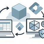
Here’s what’s different about connecting Dynamics 365 HR and other systems with Microsoft Fabric. Instead of a string of patchwork integrations, you use built-in connectors and Dataflows Gen2 to set up direct, managed imports that point right at the source. You pick your entity—for example, LeaveRequests from Dynamics 365 HR. With the Fabric connector, you authenticate the service, select the tables or fields you need, and set the cadence for automatic updates. If your external system—say, a payroll SaaS—offers an API or even just recurring flat-file drops, Dataflows Gen2 can grab that too. It’s not just a question of moving data; it’s about making sure that data lands in the Fabric lakehouse in a predictable, repeatable way.
Let me show you what this looks like in practice with leave balances. You define two connections: one for your core HR data inside Dynamics 365 HR, and one for the external payroll system. Both feed structured data (let’s say employee IDs, accruals, and approved time off) into the same Fabric lakehouse. You use Dataflows to map out the fields—aligning names, handling department codes, making sure whatever the payroll system calls 'PTO' matches the term in Dynamics. The mapping step is crucial because it’s where you finally resolve all those tiny differences that keep data sets from agreeing. If the payroll service spits out balances as decimals but HR uses whole days, the transformation happens here—no more chasing down the right numbers after the fact.
Careful scheduling means you set up Dataflows to run on a cadence that matches business needs. You can have full refreshes every night or incremental updates every hour. Either way, you’re no longer relying on manual intervention, which is usually where things fall apart. This also helps deal with failures. If an import stalls, Fabric logs the error and keeps the previous dataset, so you don’t end up wiping out your history with an incomplete upload. Add in some simple alerts, and you actually know when something goes sideways—rather than learning the hard way after a missed payroll cycle.
Some HR systems play nicer than others. Dynamics 365 HR obviously speaks Microsoft’s language, but some outside vendors hold onto data in odd formats or require custom field mapping. You may have to adjust for mismatched unique IDs, custom delimiters, or missing historical data. Sometimes you’ll run into systems with outdated APIs or those that only export data once a week. Those edge cases are where Dataflows Gen2 shows its value—letting you preprocess those quirks so they don’t infect the main data set. With some planning, even the most frustrating external tool can be bent to fit the process.
This is the real payoff for HR teams: unified data isn’t theoretical. Once both systems feed into Fabric, and you’ve sorted the mapping and refresh cycles, the actual dashboard build is almost boring. Leave balances sync up, discrepancies stand out instantly, and manual cross-checks become a thing of the past. So now you go from days patching reports together to a single, reliable dashboard that answers the question “who has time off left?” in real time.
But of course, the real opportunity isn’t just up-to-date dashboards. With all this data unified—and up to the minute—you see the cracks before they turn into big problems. So the next step is figuring out if you can go even further and actually spot attrition risks before they steal your best people.
Scaling Up: Predictive Insights and the Real Future of HR Analytics
What actually happens when HR stops reacting to last month’s numbers and starts predicting what’s coming next? After you’ve pulled your data together and built the dashboards, there’s usually this sense of relief—finally, the leave balances are right, onboarding stats reflect what’s happening, and attrition shows up as real-time metrics, not stale quarterly summaries. But here’s the catch: most HR teams don’t go any further. The dashboards come up once a month in some meeting, a few trend lines get flagged, and then everything gets filed away until the next review. Meanwhile, the same problems keep creeping up—high performers quietly leave, new hires get stuck waiting for access, and people with burnout symptoms slip through unnoticed. That’s the missed opportunity when you stick to just reporting the past.
The biggest advantage of actually having unified HR data is what you can do with it once it’s all in one place. Not just counting heads or showing pretty charts, but actually spotting signals that matter while there’s still time to act. This is where companies using predictive analytics have a real edge. With the right tools layered on top of unified data, some organizations are already picking up on retention risks, likely departures, or teams about to hit a bottleneck—sometimes weeks before the usual warning signs show. It’s the difference between asking “why did people leave?” and “who’s at risk of leaving right now, and why?” For HR teams still working off last quarter’s spreadsheets, that’s a gap that keeps widening.
This is where Fabric’s ecosystem turns from “nice to have” to something genuinely strategic. Microsoft’s approach is built around letting you move from static reporting to actual machine learning, all within the same architecture. Once your data lives in the Fabric lakehouse, you can bring in ML models—either built from scratch in Azure Machine Learning or using built-in AutoML features—to start forecasting trends. That can mean anything from predicting which departments are likely to lose people, to highlighting where onboarding stalls based on how long it takes for new staff to get through each stage. It’s not magic, just logic running on more complete data and flagging patterns people usually miss.
Let’s get concrete. There’s a healthcare provider that unified their HR data—everything from performance reviews to leave requests and onboarding times—into a single Fabric lakehouse setup. Before that, they ran the usual set of monthly turnover reports and tried to chase down why nurses were leaving. With all their data joined up and some fairly straightforward ML applied, they started predicting clusters of staff likely to exit within the next 90 days, and traced those patterns back to shift schedules and missed onboarding steps. They targeted interventions early—adjusting shift loads, nudging managers to check in—and managed to cut their voluntary attrition by over 15% within a year. Not by hiring more recruiters, but by actually seeing “Who’s at risk?” in time to step in. That’s not a flashy use-case, it’s just what happens when you go beyond counting past events.
Of course, bringing predictive analytics into HR isn’t a case of flipping a switch. You’ve got to deal with the real-world blockers: data quality jumps out fast, because models don’t handle missing or messy fields gracefully. You can’t just press ‘run’ on prediction; someone has to prep and clean the data, define what “attrition risk” means, and make sure you’re not picking up false positives just because a department changed managers. Then there’s model transparency. HR leaders—and legal teams—need to understand why someone gets flagged as a risk, especially with increased scrutiny around bias and fairness. Models built in Fabric’s ecosystem can be audited for transparency, and outputs can be customized so HR can see the drivers, not just the outcome.
There’s also the old story of buy-in. It’s one thing to have charts and forecasts. It’s another to convince managers and senior leaders to trust a machine learning warning over their gut feel about who’s getting ready to leave. That’s where you need clear, actionable insights—not black boxes spitting out risk scores with no explanation. Fabric’s environment helps here, because the models sit right on top of unified data, and the dashboards can reference that lineage every step of the way.
This is the other thing that’s often missed: you don’t have to choose between simple dashboards and complex predictive tools. Fabric’s architecture scales with whatever your team is ready to do. You start with basic metrics. Then, as confidence grows—and leadership gets used to seeing reliable headcount numbers—you layer on automated trends, forecasts, even experimentation with external data sources. It all happens in the same ecosystem, so you’re not wasting months moving models between platforms or staring at static charts that never get smarter.
Just imagine this for a second: instead of waiting for turnover to hit and then scrambling for a response, HR actually flags high-risk teams and triggers early conversations with managers before things go off the rails. Maybe it’s identifying onboarding delays that predict which new hires are likely to struggle. Or pairing survey data with absence records to spot potential burnout cases before PTO spikes hit your department. That’s HR moving out of the rearview mirror, and into something a lot more proactive.
Here’s the mini-payoff: with unified HR data and machine-learning-based analytics inside Fabric, HR teams don’t just report problems after the fact—they can anticipate them, explain them, and help the rest of the business take action early. It’s the turning point where HR shifts from being the last to know, to the team that signals what’s ahead.
Think about this: if you’re ready to step past the world of static reports and endless spreadsheets, where does that leave your HR setup in the bigger picture?
Conclusion
If you’re still stitching together HR data by hand, you’re running your business on hope instead of facts. Unified HR data is what separates guesswork from actually steering your workforce in the right direction. It’s about seeing problems as they start—not weeks after the fact. Microsoft’s ecosystem, especially when you bring Fabric and Dynamics together, is finally at a point where dashboards can show the real story and give warnings before it’s too late. If that sounds like what you’ve been missing, stick around. We break down exactly how to make your data work—not just for reports, but for real decisions.


