


In a world that increasingly values data privacy, I found myself reflecting on a conversation with a financial services client recently. They were concerned about who could access their sensitive sales data. It struck me how many organizations overlook the importance of robust security measures like row-level security (RLS), often waiting for a breach to take action. This realization inspired my exploration of RLS in Microsoft Fabric, and I’m excited to share what I’ve learned about safeguarding confidential information without jeopardizing analytics capabilities.
1. The Cost of Unsecured Data: A Wake-Up Call
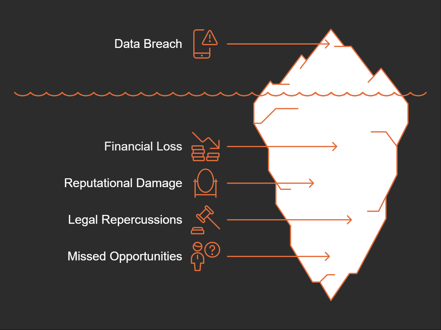
We live in a digital age where data is everything. But what happens when that data is unsecured? The cost can be staggering. Just think about some of the real-life scenarios that have played out when companies fail to protect sensitive information. It’s a wake-up call we can’t ignore.
Real-life Scenarios of Data Breaches
Let’s start with a high-profile example. A global retail corporation found itself in hot water when sensitive salary and bonus information was leaked due to unsecured access. Employees who shouldn’t have had access to this information could easily view it, leading to massive trust issues within the organization. It’s a classic case of poor security practices leading to disastrous consequences.
Another case involved a financial services firm that faced scrutiny because their sales data was accessible to anyone in the organization. The worry expressed by clients was palpable: “Is anyone else seeing my confidential sales data?” Their concern was valid and highlighted the critical need for safeguards in data management.
The Fallout of Poor Data Security
The fallout from these breaches isn’t just about data loss. The reputational damage can take years to repair. Organizations often face public backlash, losing customers and, ultimately, revenue. When trust is compromised, can you really expect customers to return? It’s like a spilled drink at a party—once it’s out, you can’t just wipe it away and pretend it didn’t happen.
Legal Repercussions
Unsecured sensitive information can lead to hefty legal repercussions. Think about it: when personal data is compromised, regulatory bodies come knocking. Fines and compliance penalties can cripple a business. The legal framework around data protection has tightened significantly. If organizations don’t adhere to regulations like GDPR or HIPAA, the consequences can be severe.
Critical Need for Safeguards
So, how do we prevent these costly breaches? There’s a critical need for effective safeguards in data management. Implementing row-level security (RLS) can limit access to sensitive information based on roles. This means only those who need to see specific data can view it. It’s a simple yet effective way to mitigate risks. Why wouldn’t you want to protect your organization this way?
Missed Opportunities from Unauthorized Data Disclosures
When data is disclosed without authorization, organizations also miss out on countless opportunities. Think about it: every time sensitive data leaks, it can lead to lost partnerships or failed negotiations. Potential clients may think twice before engaging with a company that can’t protect its data.
Understanding the Perspectives of Worried Stakeholders
Stakeholders are often on edge. They want assurance that their data is secure. As I reflect on these perspectives, it’s clear that organizations must prioritize data security. After all, if stakeholders are worried, it’s likely to translate into hesitation or even loss of business.
I often wonder: what would it take for companies to realize that securing data is not just an IT issue, but a business imperative?
"Data is the new oil, but like oil, if spilled, it can cause great damage." - Unknown
In conclusion, the consequences of unsecured data breaches are alarming. They serve as a foundational reason for understanding the importance of security measures. I believe that by prioritizing data security and implementing robust safeguards, we can avoid the pitfalls that many organizations have fallen into. It’s time to wake up and take action!
2. Row-Level Security: A Key to Data Confidentiality
What is Row-Level Security (RLS)?
Row-Level Security, or RLS, is a powerful data protection feature that restricts access to specific rows in a database based on the user’s identity. Think of it as a lock on a file cabinet. Only authorized individuals can open the drawer and see the contents. This functionality ensures that sensitive information remains confidential and is only visible to those who need to see it.
Who Can Benefit from RLS?
RLS can significantly benefit various stakeholders within an organization. This includes:
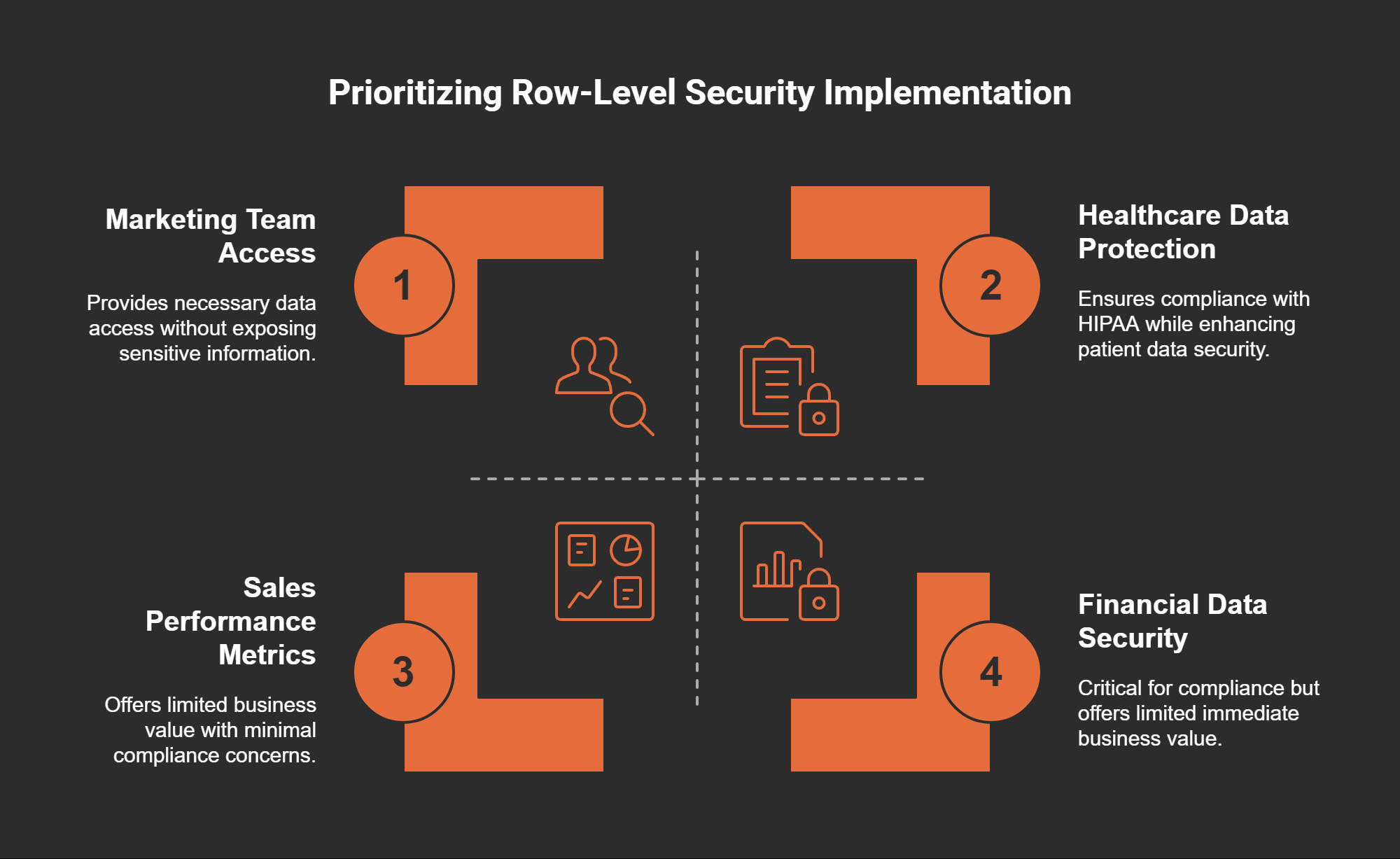
Marketing Teams: They may need access to customer data but should not see sensitive financial information.
Sales Personnel: Sales teams might only require visibility into their performance metrics.
Executives: Higher management may need access to aggregated data without delving into personal employee records.
By defining roles and access levels clearly, RLS creates a tailored data experience, ensuring everyone has the right information at their fingertips.
Compliance with Regulations
Organizations face strict regulations like GDPR and HIPAA, which require them to protect sensitive data. RLS is an effective tool in ensuring compliance. For instance:
GDPR: This regulation mandates that personal data should only be accessible to authorized individuals. RLS helps in enforcing this rule.
HIPAA: In healthcare, RLS ensures that only designated personnel can view patient records, safeguarding privacy.
Implementing RLS means organizations can enhance their compliance posture while protecting sensitive data from unauthorized access.
Case Studies of Successful RLS Implementation
Let’s look at a real-world scenario. A global retail corporation faced significant reputational damage when employees accessed sensitive salary and bonus information. This oversight could have been avoided by implementing RLS. Their reliance on shared Power BI reports created an environment where unauthorized access happened. After introducing RLS, they restored internal trust and improved operational focus by limiting access to sensitive financial details.
Such cases illustrate the importance and effectiveness of RLS in maintaining data confidentiality.
Technical Steps for Setting Up RLS in Power BI
Setting up RLS in Power BI is straightforward. Here’s a quick guide:
Open Power BI Desktop: Start with your report in Power BI Desktop.
Modeling Tab: Click on the “Modeling” tab and select “Manage Roles.”
Create Roles: Define new roles and set the DAX filter expressions that determine data visibility.
Test Roles: Use the “View as” feature to test the roles you’ve created.
Publish: Once satisfied, publish the report to Power BI Service, where RLS will be enforced.
These steps ensure that your data remains secure while being easily accessible to authorized users.
Realizing the Business Value of Secure Data Access
Implementing RLS is not just about preventing unauthorized access; it also offers significant business value. By ensuring that users only see relevant data, organizations can:
Enhance Decision-Making: With accurate data at their fingertips, teams can make informed decisions.
Increase Trust: When employees know their data is secure, it fosters a culture of openness.
Streamline Compliance: With automated access controls, organizations can more easily meet regulatory requirements.
As the saying goes,
"The strongest security lies in the way access is defined at the source." - Unknown
This rings especially true as RLS empowers businesses to manage data access wisely and strategically.
Conclusion
In a world where data breaches are all too common, implementing Row-Level Security is not just a technical requirement but a critical business necessity. Whether you’re a small business or a large enterprise, understanding and utilizing RLS can protect your sensitive data and foster a secure environment for all users.
3. Moving Into Object-Level Security: A Deeper Dive
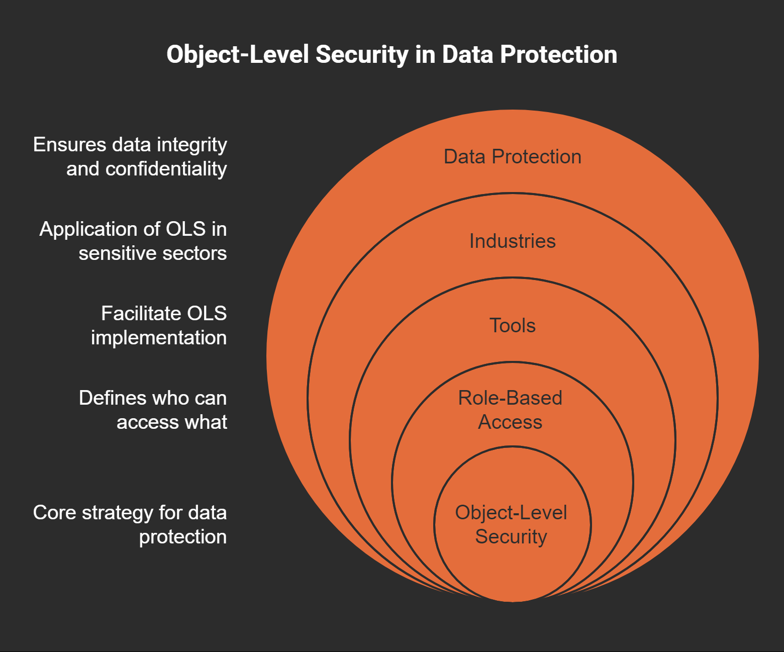
As we delve into the realm of data security, one term often arises: Object-Level Security (OLS). But why should we care about OLS? What makes it different from the more commonly known Row-Level Security (RLS)? Let's dive into the distinctions and implications of OLS, especially in sensitive industries.
Understanding OLS vs. RLS: What Sets Them Apart?
First, let’s break it down. Row-Level Security (RLS) restricts data access at the row level. Think of it as a fence around a garden: it keeps some plants hidden from certain people. In contrast, Object-Level Security (OLS) acts like a vault. It can hide entire tables or specific columns from unauthorized eyes.
Imagine you’re a financial manager. With RLS, you might see your department’s budget, but OLS could prevent you from even knowing other departments have budgets, ensuring that sensitive financial details remain confidential.
In the world of data, to be seen is often to be vulnerable. This quote captures the essence of why OLS is crucial for many organizations. Protecting data isn’t just about who sees it; it’s about making sure that the data isn’t exposed, even indirectly.
Real-World Applications of OLS in Sensitive Industries
Now, let’s talk about where OLS truly shines. In sectors like healthcare, finance, and government, the stakes are incredibly high. For instance, a healthcare organization may need to implement OLS to ensure that only HR has visibility into sensitive employee salary information. This safeguard helps prevent potential regulatory compliance failures, keeping both the employees and the organization safe.
Healthcare: Protecting patient records and sensitive employee information from unauthorized access.
Finance: Securing financial data from non-authorized personnel to maintain compliance and trust.
Government: Ensure sensitive governmental data is only accessible to authorized users.
Tools for Implementing OLS Effectively
Implementing OLS isn’t just a walk in the park. It requires the right tools. One such tool is Tabular Editor. It allows organizations to manage security settings more effectively, going beyond what’s offered natively in platforms like Power BI. With it, you can define roles and permissions meticulously, ensuring everything is locked down properly. Without these tools, organizations risk misconfigurations that could lead to significant vulnerabilities.
The Significance of Structuring Data Protections Correctly
One of the most critical aspects of OLS is how you structure your data protections. Think of it like building a house. If the foundation isn’t strong, the whole structure can crumble. Misconfigured roles can lead to unauthorized access, which can be disastrous. Testing these configurations rigorously within a controlled environment, such as Power BI Desktop, is essential.
Handling Extreme Sensitivity: OLS Use in Healthcare
As previously mentioned, healthcare is a prime example of where OLS is necessary. In this field, protecting patient information isn’t just about compliance; it’s about trust. If patients feel their data is at risk, they may be less willing to seek care. For a healthcare organization to thrive, its data security measures must be foolproof.
Consolidating Security Measures with OLS for Varied Datasets
When dealing with varied datasets, consolidating security measures through OLS can streamline the complexity. By ensuring certain sensitive datasets are entirely invisible to unauthorized users, organizations can maintain a tighter grip on their data landscape. It's about creating a seamless experience while ensuring the right people have access to the right data.
In summary, as we explore the world of OLS, we uncover a critical layer of security. It’s not just about accessibility; it’s about ensuring that sensitive data remains hidden from those who shouldn’t see it. In a world where data breaches can lead to severe consequences, implementing OLS can be a game-changer for organizations committed to protecting their sensitive information.
4. Agile Data Handling with Incremental Refresh
Have you ever felt overwhelmed by the sheer volume of data your organization generates? You’re not alone. Managing data efficiently is crucial. Enter incremental refresh. But what does that actually mean? In simple terms, incremental refresh is a data management strategy that updates only the parts of your data that have changed. This is a game-changer in the world of data handling.
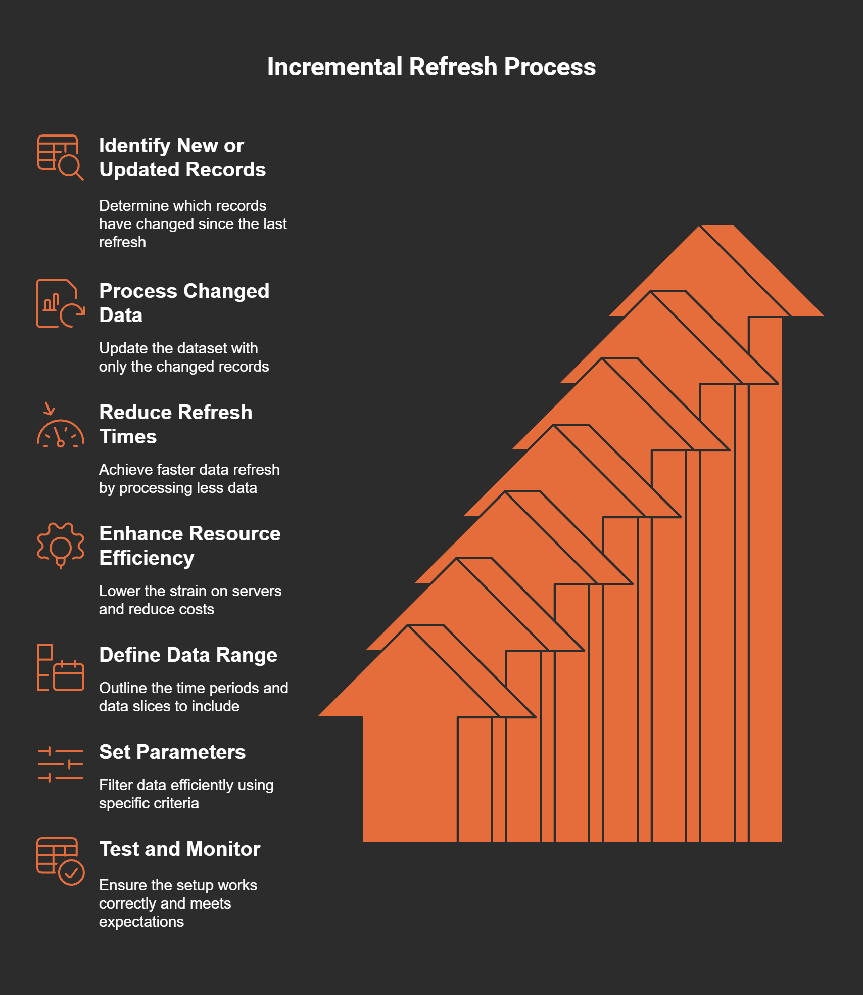
What is Incremental Refresh and How Does it Work?
Incremental refresh works by focusing on new or updated records instead of reloading the entire dataset each time. Think of it like watering a plant. You wouldn't dump a whole bucket of water on it every time; instead, you’d just give it what it needs. Similarly, with incremental refresh, we only process what has changed since the last refresh. This approach not only saves time but also reduces the strain on your system.
Benefits of Incremental Refresh: Performance Gains and Resource Efficiency
Why should organizations adopt incremental refresh? Here are some benefits:
Performance Gains: By processing only changed data, the refresh times are significantly reduced. Imagine how much more efficient your reporting could be!
Resource Efficiency: Less data to process means less strain on your servers. This can lead to cost savings in terms of infrastructure and maintenance.
As someone who has seen the impact of efficient data operations first-hand, I can assure you of one thing:
“Efficiency in data operations is not a luxury, but a necessity for survival.” - Unknown
Best Practices in Setting Up Incremental Refresh
To get the most out of incremental refresh, here are some best practices:
Define Your Data Range: Clearly outline the time periods and data slices you want to include. This is essential for effective data management.
Use Proper Parameters: Setting parameters allows you to filter data efficiently. This helps in optimizing what gets refreshed.
Test and Monitor: Always test your incremental refresh setup in a controlled environment before rolling it out. Monitor performance to ensure it meets expectations.
Comparing Traditional and Incremental Methods in Terms of Data Load
Let's take a moment to compare traditional data refresh methods with incremental refresh:
Traditional Methods: These often involve reloading entire datasets, which can lead to longer load times and increased system strain.
Incremental Methods: They focus on updating only what’s necessary, leading to faster refresh times and better resource allocation.
It’s like comparing a marathon runner to a sprinter: the sprinter (incremental refresh) is quick and efficient, while the marathon runner (traditional methods) may take longer and use more energy.
Case Examples Illustrating Successes with Incremental Refresh
Many organizations have embraced incremental refresh with significant success. For example, a retail client of mine reduced their data refresh time from several hours to just minutes! This allowed their analytics team to focus on insights rather than waiting for data to load. Another case involved a financial services provider that maintained up-to-date reports without overwhelming their servers. The benefits were clear: better decision-making and increased trust in the data.
How to Define Parameters Effectively for Optimal Results
Setting the right parameters is crucial for an effective incremental refresh. Here are some tips:
Identify Key Fields: Determine which fields are essential for tracking changes.
Utilize Date Ranges: Use timestamps to filter records. This helps in pinpointing exactly which records need updating.
Segment Your Data: Dividing your data into manageable segments can enhance your refresh strategy.
By defining parameters effectively, you ensure that your refresh process remains agile and responsive to your organization’s needs. Remember, it's all about keeping your data fresh while minimizing overhead.
In our fast-paced world, the ability to handle data efficiently can set an organization apart. Implementing incremental refresh techniques could very well be the key to reducing overhead while keeping your data relevant and actionable. It's a leap toward efficiency and operational excellence that I believe every organization should consider.
5. Optimizing Report Performance and User Experience
When it comes to report performance, the stakes are high. Users expect swift responses and smooth interactions. Slow reports can frustrate users, leading to dissatisfaction and disengagement. So, how do we optimize report performance? Let's dive into some practical steps that can make a real difference.
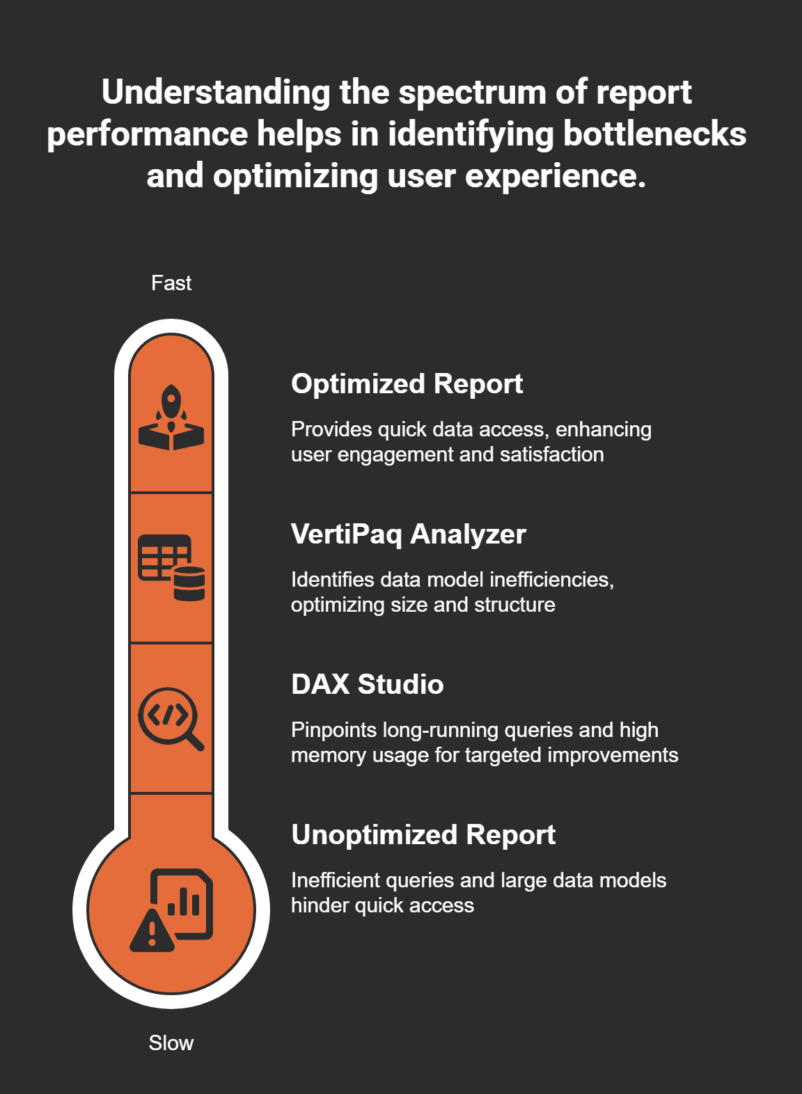
Diagnosing Slow Reports with DAX Studio
First, let’s talk about DAX Studio. This powerful tool is like a diagnostic machine for your reports. It helps you analyze your DAX queries and identify bottlenecks. I remember the first time I used it; I found a query that took ages to run. After some tweaks, I reduced its execution time significantly. Here’s how to use DAX Studio:
Open DAX Studio and connect it to your Power BI model.
Run your queries and observe the performance metrics.
Look for long-running queries or high memory usage.
By focusing on these insights, you can pinpoint where improvements are needed. It’s a game changer!
The Impact of Performance Optimization on User Satisfaction
Now, let’s consider the impact of performance optimization. Think of it this way: a well-optimized report is like a well-seasoned dish; it satisfies the user and makes them come back for more. Users love speed and efficiency. When reports load quickly, they are more likely to engage with the content. This leads to better decision-making and more effective use of data.
Effective Query Performance Analysis: What to Look For
What should you look for when analyzing query performance? Here are a few key aspects:
Execution time: How long does the query take to complete?
Resource usage: Is it consuming too much memory or CPU?
Data volume: Are you pulling in too much data unnecessarily?
By keeping an eye on these factors, you can continuously refine your queries and improve overall performance.
Common Pitfalls in DAX Expressions and How to Avoid Them
While working with DAX, many of us fall into common pitfalls. Have you ever written a DAX expression that seemed straightforward, only to find it was performing poorly? Here are some common mistakes to avoid:
Using
FILTER()too liberally can slow down performance.Nesting too many calculations can lead to complexity and inefficiency.
Not using variables effectively can cause repeated calculations.
By being aware of these pitfalls and adjusting your approach, you can enhance the performance of your DAX expressions.
Using VertiPaq Analyzer for Enhancing Data Model Performance
Another tool worth mentioning is the VertiPaq Analyzer. This tool helps you see how your data model is performing. It can highlight areas where you might be using too much space or where optimizations can be made. For instance, I once discovered that I had unnecessary columns in my model, which were bloating the size and slowing down report loading times.
Here’s how you can utilize VertiPaq Analyzer:
Analyze your data model's size and structure.
Identify large tables and columns that can be optimized.
Make adjustments based on the findings to streamline performance.
Improving Report Loading Times: Real-World Implications
Finally, let's discuss the real-world implications of improving report loading times. Fast loading reports mean users can access critical data quickly. This is especially important in environments that rely on real-time analytics. Consider a sales team needing immediate insights during a presentation. If the report is slow, they might miss key opportunities.
In my experience, improving report loading times has led to increased user adoption and satisfaction. By implementing the strategies we've discussed, you’ll not only enhance performance but also foster a more engaging user experience.
"A well-optimized report is like a well-seasoned dish; it satisfies the user and makes them come back for more." - Unknown
By focusing on practical steps and tools, we can significantly optimize report performance. The journey may seem daunting, but the rewards are worth it. So, let’s get started on making our reports faster and more user-friendly!
6. Crafting Effective Data Visualizations: Beyond the Basics
When it comes to data, the way we present it can make all the difference. Visuals can tell a story that raw numbers simply can’t. This is the art of storytelling with data. Think about it: how often have you looked at a chart and instantly grasped a concept that was buried in a dense report? Powerful visuals speak volumes and can transform tedious data into compelling narratives.
The Art of Storytelling with Data
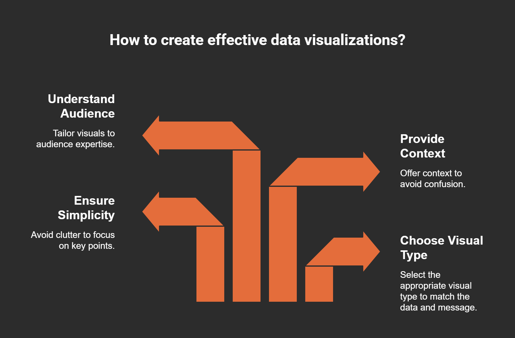
Data visualization is not just about making things pretty. It's about communicating ideas effectively. A well-designed chart can engage your audience and drive home your message. But how do we create visuals that resonate?
Choose the right type of visual: Each dataset has its own story. A line graph may be perfect for trends over time, while a pie chart can show proportions effectively.
Ensure simplicity: Avoid clutter. Too much information can overwhelm. Focus on key points that need emphasis.
Context matters: Always provide context. Let your audience know what they’re looking at. A good visual without context can confuse rather than clarify.
Tips for Selecting the Right Visuals
We’ve all seen a chart that left us scratching our heads. So how do we avoid common visualization errors? Here are some tips:
Understand your audience. What are their needs? Tailor your visuals to their level of expertise.
Match the visual to the data context. For example, if you’re showcasing changes over time, a line graph is typically the best choice.
Avoid using 3D visuals. They can distort perception and mislead your audience.
The balance between clarity and aesthetics is pivotal. Yes, a beautiful chart can catch the eye, but if it obscures the message, it defeats the purpose. Imagine a stunning infographic filled with data that’s hard to interpret. Frustrating, right?
Real-Life Examples of Effective Data Storytelling
Let’s consider a real-life scenario. A financial services company once shared a bar graph that compared their quarterly profits. It was straightforward and clear. The colors were distinct, and each bar represented a specific quarter. Their stakeholders were able to grasp performance trends at a glance. Contrast that with a poorly designed pie chart that tried to show too much data. The stakeholders felt lost, and the message was muddled.
As we navigate through our data storytelling journey, we must always remember to understand our audience's needs. What do they care about? What insights will they find most valuable? Tailoring our visuals to meet those expectations can lead to more effective communication.
Avoiding Common Visualization Errors
There are pitfalls that we need to avoid. For instance, using too many colors can distract the viewer. Instead, a limited palette can help emphasize the key points.
Another common mistake? Overloading charts with data points. Keep it simple. Highlight the most important data, and let the visuals do the talking.
"Good data visualization is more than just pretty pictures; it's about conveying truth clearly." - Unknown
The Balance Between Clarity and Aesthetics
Finding that sweet spot between beauty and clarity can be challenging. For example, think of a well-designed dashboard. It’s not only visually appealing but also intuitive. It guides the user through the data without overwhelming them. That’s the ideal scenario. We want our visuals to captivate and inform.
Final Thoughts
In conclusion, crafting effective data visualizations is an art form. It requires understanding your audience, selecting the right visuals, and avoiding common pitfalls. As we continue to explore the world of data, let's strive to tell stories that resonate. After all, data is only as powerful as the message it conveys.
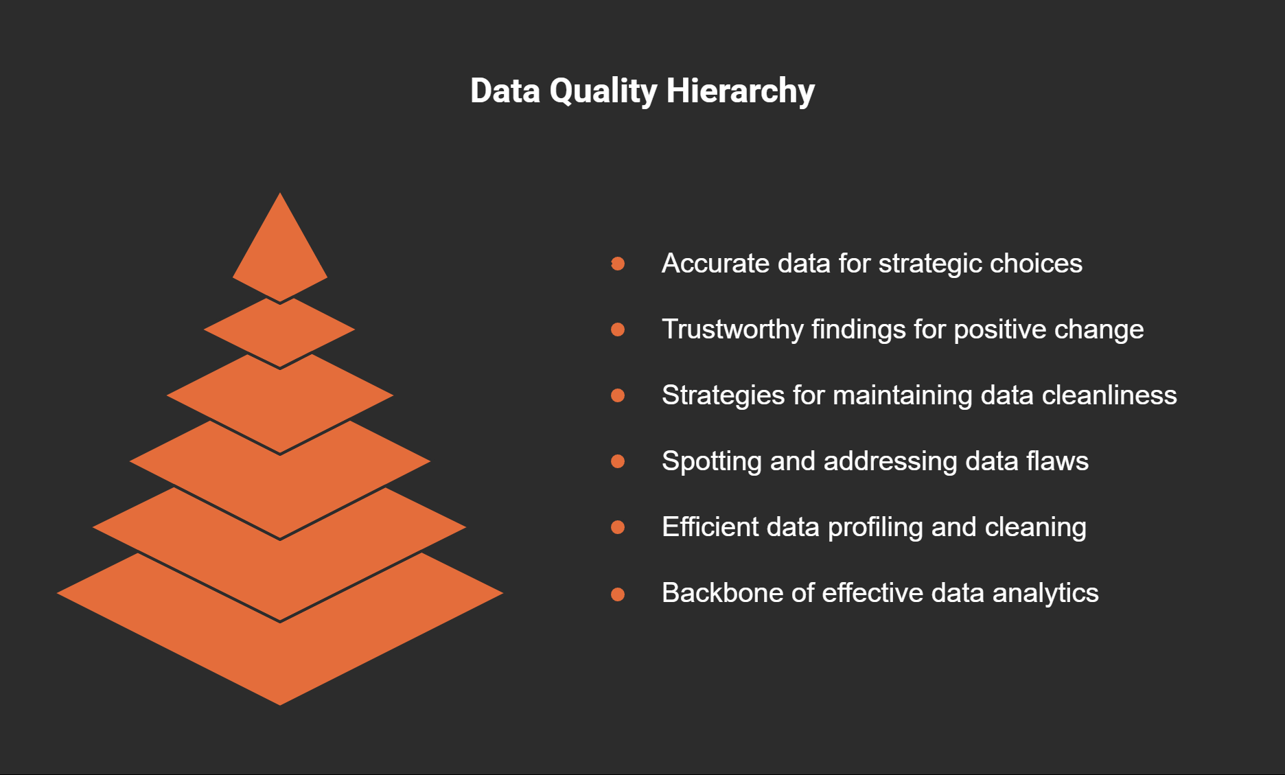
Navigating the Terrain of Data Quality and Integrity
In our journey through the intricacies of data analytics, we must pause to consider a vital aspect: data quality. It’s not just a buzzword; it’s the backbone of effective analytics. Without quality data, our analyses may lead us astray. Why is that? Well, consider this: "Quality data is the life blood of any analytical endeavor; without it, you're merely guessing." - Unknown. If we’re guessing, how can we make informed decisions? Let’s delve deeper into this essential topic.
Why Data Quality Matters
First off, we need to recognize why data quality matters so much. Think about it: if the data you’re working with is flawed, your decisions based on it will also be flawed. Imagine trying to navigate using a map that has inaccurate roads. You’d likely end up lost, right? The same applies to data analytics. Low-quality data can lead to misinformation, poor strategy development, and wasted resources.
Tools and Techniques for Profiling Data in Power Query
One of the most effective tools for ensuring data quality is Power Query. This powerful feature within Microsoft tools allows us to profile our data efficiently. But how do we go about it?
First, utilize the Data Profiling tools available in Power Query. These tools help identify data types, unique values, and even null entries.
Second, apply filters to spot outliers and inconsistencies. Are there values that don’t belong? Are some records missing critical information?
By profiling data effectively, we can catch issues early, preventing them from spiraling into larger problems later on.
Identifying Common Data Inconsistencies
So, what are these common data inconsistencies? Here are a few examples:
Duplicate Entries: These can skew results significantly. Always check for and remove duplicates.
Missing Values: Gaps in data can lead to incomplete analyses. Filling or eliminating these is essential.
Inconsistent Formats: Dates, for instance, may appear in various formats. Standardizing these is key.
Each inconsistency can have ripple effects on our analyses. They can lead to incorrect conclusions, which can impact business decisions.
Best Practices for Ensuring Data Cleanliness
Now that we know what to look for, let’s talk about best practices. Here’s what I recommend:
Regular Data Audits: Schedule consistent checks to ensure data remains clean and reliable.
Automate Data Cleaning: Use tools that can automate data cleaning tasks to reduce human error.
Establish Clear Data Entry Protocols: Provide guidelines for data entry to maintain consistency and accuracy.
By following these practices, we can maintain a high standard of data cleanliness, ensuring the reliability of our analyses.
Leveraging Good Data for Ethical Insights
Good data isn’t just about numbers; it’s about the insights we derive from it. Ethical insights promote accountability and transparency. When we have clean data, we can trust our findings. This trust translates into ethical business insights that can guide strategies and operations. We’re not just crunching numbers; we’re driving positive change!
The Ripple Effect of Poor Data on Business Decision-Making
Finally, let’s discuss the ripple effect of poor data. Picture this: A company relies on outdated sales figures to make forecast decisions. As a result, they overstock inventory, leading to wasted resources and lost revenue. In contrast, accurate data would have provided a clearer picture, enabling informed decision-making.
In summary, the quality of our data is paramount. Poor data can lead to misguided strategies and lost opportunities, while good data fosters informed and ethical decision-making. As we conclude our exploration of data quality, remember that it is a cornerstone of successful data practices. It intertwines closely with security measures, as clean and secure data leads to more reliable insights. Let’s embrace the importance of data quality as we continue to navigate our way through the evolving landscape of analytics.


